Do you know how ‘fun’ it is to build a fully custom Order History page without a single user to talk to?
I do! and I made it work.
Redesign Order History
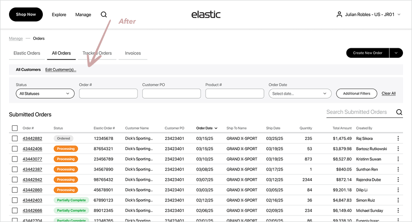
Wholesale buyers manage hundreds of orders with varying statuses, ship‑tos, POs, and custom pricing. The legacy Order History was slow, dense, inconsistent across devices, and split across three different resources forcing tool‑switching.
My Role
Product Designer
end‑to‑end: research → UX/UI → QA
Team
Designer
PM
DevsQA
Business Model
SaaS
E-commerce
B2B
Scope
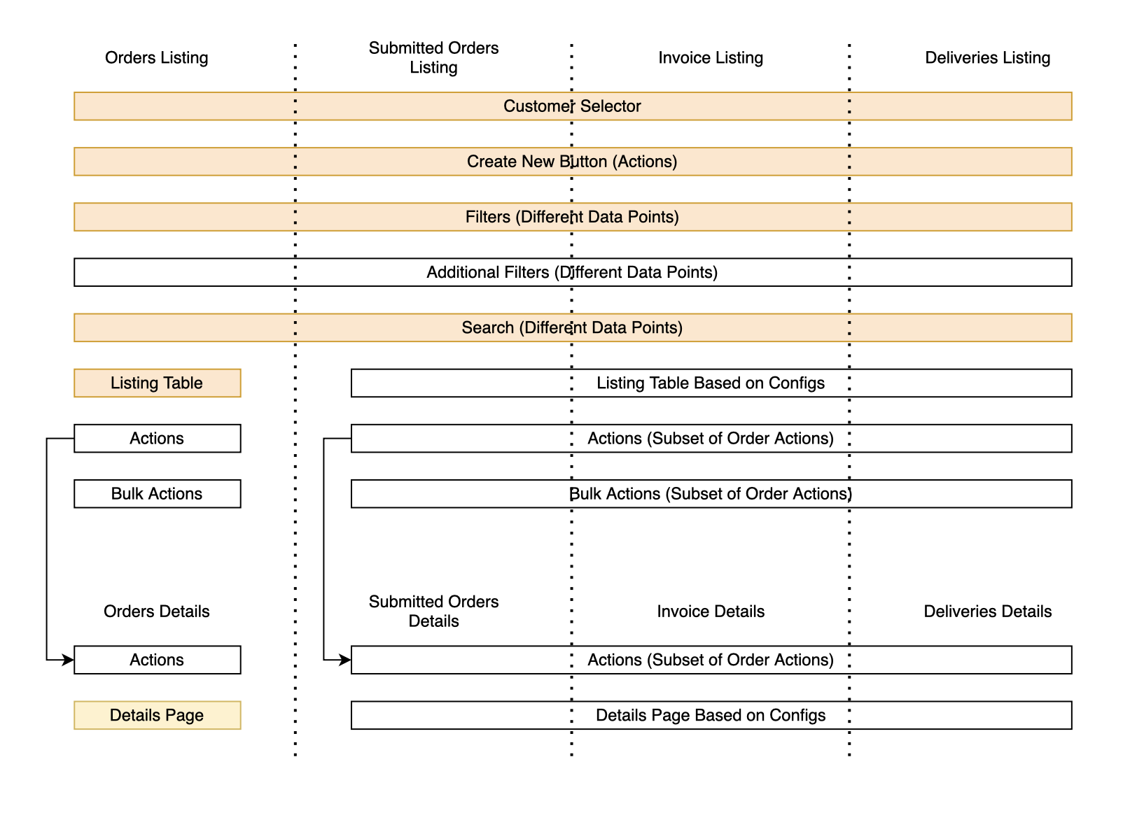
Order Listing
(Internal + ERP)
Order Details
(Internal + ERP)
Invoice Listing
Deliveries (calendar)
Tools
Figma
FigJam
Jira
Confluence
Amplitude
My Key Contributions
- Led discovery to define the problem, success metrics, and constraints.
- Ran a comparative audit of three primary Order History experiences to benchmark filters, scan patterns, exports, and performance, informing v1 scope and the roadmap.
- Mapped end‑to‑end flows for search, scan, export, reorder, invoice lookup, and specified state preservation between list ↔ details.
- Designed the two‑tier filtering model: Quick chips + Advanced modal grouped by areas.
- Unified a single, responsive table component usable across Order Listing and Invoice Listing, supporting dynamic column schemas per client (data availability/permissions), and extended the same pattern principles to Order Detail and Invoice Detail line‑items for consistency.
- Partnered with Engineering to streamline design→dev handoff: documented component specs, annotated empty/error/loading states, mapped Figma components to Storybook, and wrote acceptance criteria.
- Designed a print‑ready PDF Order template (downloadable from listing & details) with brandable header, order metadata, line‑item table.
Research Insights
I conducted interviews with our 5 largest current clients to gather targeted feedback on Order History workflows
Ability to Import order / invoice
“Most valuable feature will be able to export order with all shipment and invoices” - W.
“Export of multiple orders is really necessary for us” - C.
“Export is so important we can do it now with microsite, but can’t with Elastic” - V.
General Filters and Search
“Sales Reps are not understanding how to remove the filter pills, and the default back to the top search list box” - W.
“Filter by Product Category, Brand - is a must” - D.
“...we really like advanced filter in microsite. I want to filter by different contributions” - C.
“It’s impossible to clear search now” - V.
“The Calendar date selector is glitchy” - S.
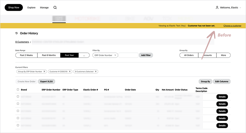
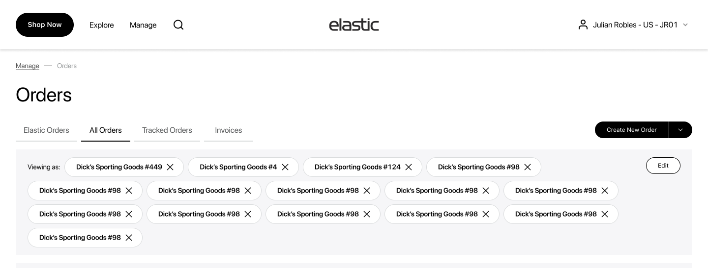
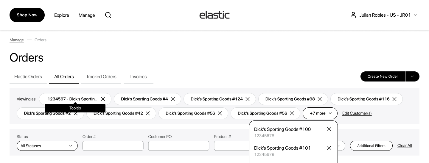
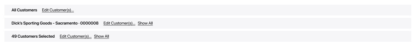
‘Customer Selector’ bar not sufficient
“Confusion how to change Customer in OH” - W.
“For Reps customer selection is a pain point as they are forced to select a customer to view order listings” - V.
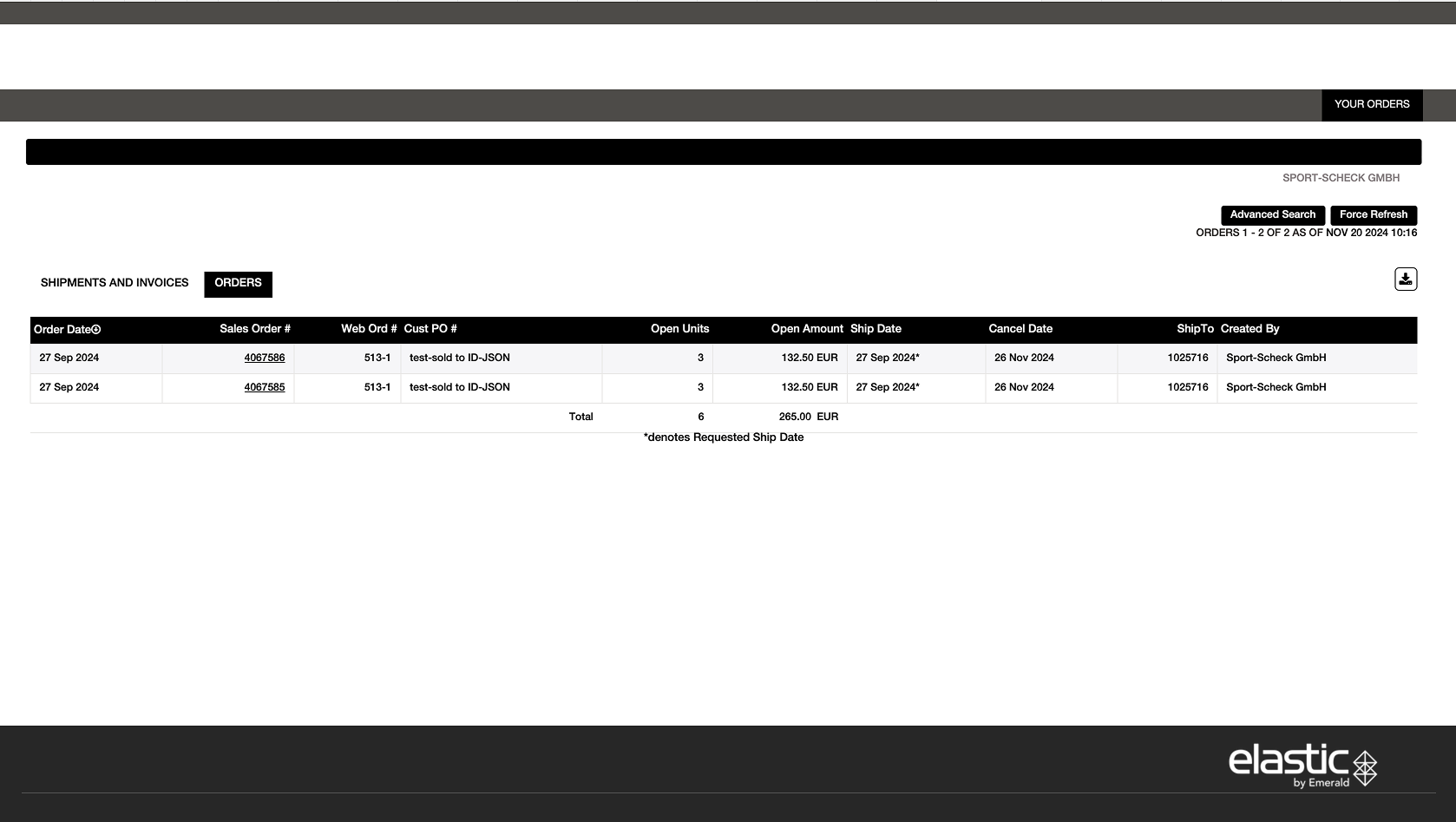
3 different sources of OH
“It’s really challenging for us to adopt of microsite is that a separate site” - C.
3 Existing Order History
Order History - Elastic
Custom Order History for our large Client
Order History - Microsite
Strategy & approach
I mapped the core technician pain points and turned them into focused design priorities.
H1 - Filter Model
Using Amplitude, I identified the most-used filters and real-world filter combinations across our top clients and elevated them into the primary UI, and placed the low-frequency, edge-case fields in the ‘Additional Filters’ modal. Amplitude insight after implementation: Advanced Filters are seldom used - 73% rely exclusively on Quick Filters. - WIn!
P2 - Universal table pattern
If we standardize a single responsive table component (dynamic column schema per client/role), then we can ship consistently across brands. - Done!
P3 - Deliveries visibility
If we surface Deliveries (incoming shipments/ETAs) directly in Order History via a dedicated Deliveries view (or preset filter + status grouping) with clear When/What/Where and tracking links, then users can self‑serve shipment answers. - Future Upgrade, but can be done by filters!
Functionality Map
Prioritization:
Now:
- Advanced search & filter for orders, invoices, shipments
- Linked documents from ERP/internal systems
- Direct shipment tracking access
- Listing & detail views for all document types
- Download/email order data and digital assets
- Direct brand support access within the interface
- Reorder from previously submitted orders
Next:
Tools to improve operational efficiency for dealers:
- Delivery calendar view for upcoming shipments Integration with tracking data to forecast delivery windows
- Helps dealers plan staffing & receiving operations
Updated Orders
Designed with users: interviews + feedback + three-version audit →
one cohesive Order History.
Main Design Decisions
Filters
Constrains:
- Multi‑brand variability. Each brand can expose a different set and count of data columns/fields → filters must adapt to available data and permissions.
- Keep the table visible. Order table should remain as high as possible; we cannot afford a tall filter block eating vertical space.
- Speed first. Users need quick filters for 80–90% of lookups; deeper filters should serve exceptional and compound cases.
Decision Adopt the two‑tier model:
- Quick filter strip
- Advanced Filters modal grouped by categories, rendering only filters that match the barnd’s schema (dynamic availability by columns/permissions).
Why a modal? (UX rationale)
- Progressive disclosure: Quick chips cover ~80–90% of queries. The modal holds the long-tail fields so the header stays clean.
- Focus = fewer mistakes: In a modal, users can concentrate on building a complex query (multi-selects, ranges) without accidental list reflows.
- Space for complexity: Room for grouped sections (Order / Payment / Shipping / Customer - could be modified), helper text and date presets, without squeezing controls.
- Mobile parity: On small screens, the modal becomes a slide-up sheet, so same structure, no new layout to learn.
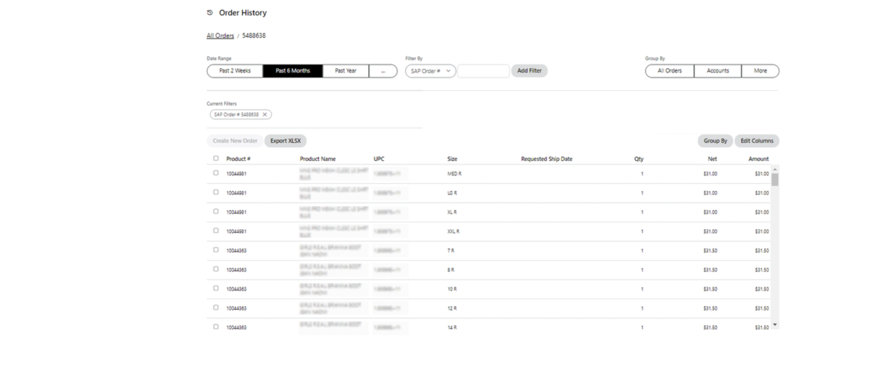
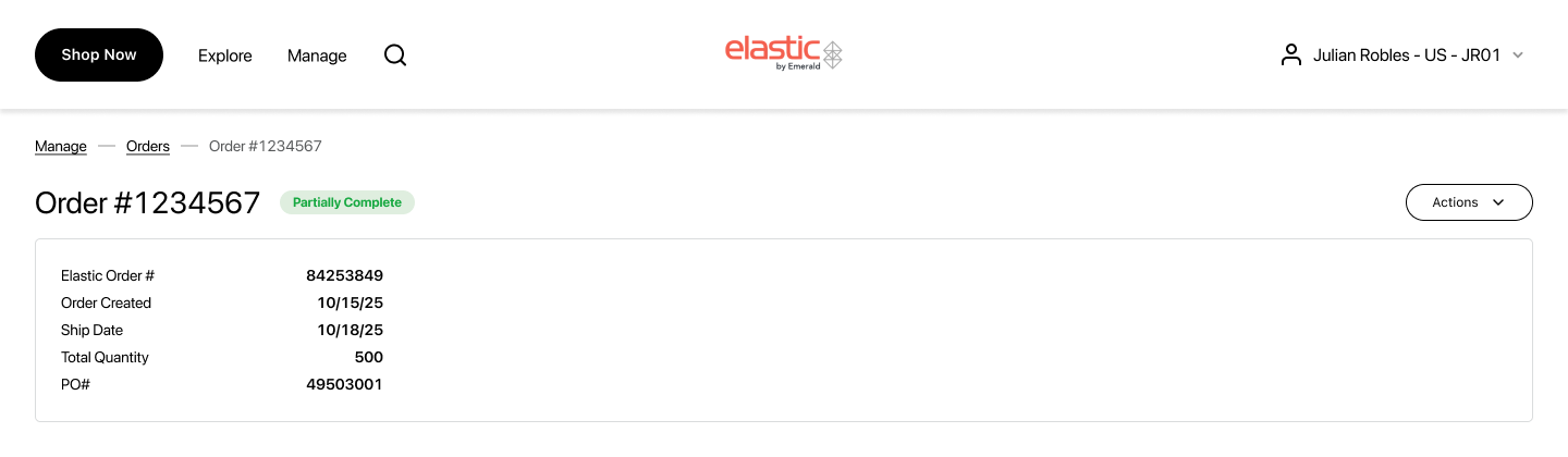
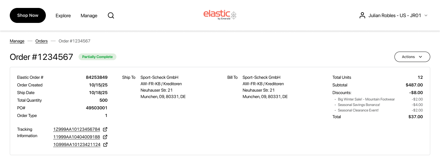
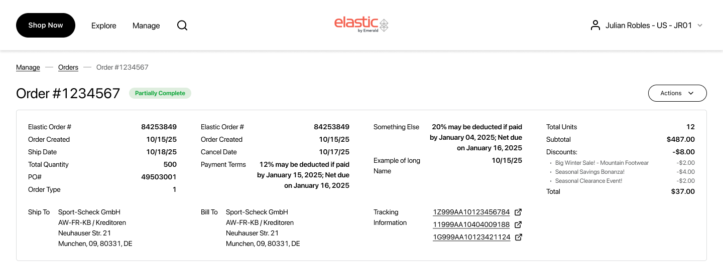
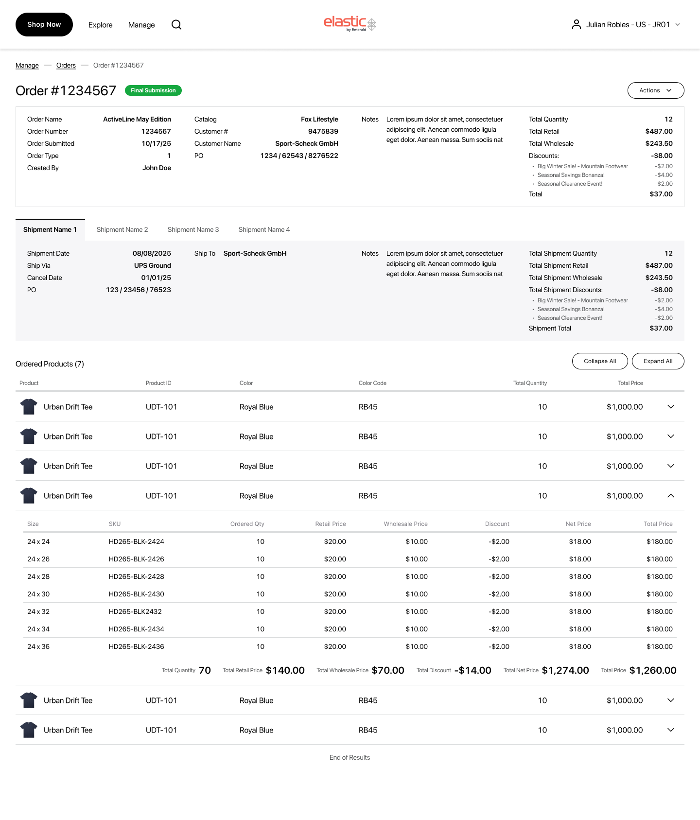
Order Details Page
Problem
- Each brand’s ERP exposes a different set and volume of fields (order attributes, statuses, discount schemes, etc.).
- The page must show Order Details and Items, where items can have per-size statuses (e.g., canceled / open / delivered), and status vocabularies vary by brand.
- In Elastic, a single order can be split across multiple shipments, adding timeline/quantity complexity.
Goal:
One consistent pattern that adapts to heterogeneous data, keeps the items table near the top, and reveals deep info without clutter.
Data variability and MockUps
- Because each brand exposes a different set and volume of fields, I designed the layout to scale from sparse to very dense data.
- These mockups also reinforced the decision to keep the financial block (if it exists) right-aligned and consistently placed, so totals remain instantly discoverable regardless of data density.
- Each column renders label on the left → value on the right.
- Count of columns and rows is dynamic per brand/data availability.
Minimum Data
Standard Data
Dense Data
Full Page Mock Up
Currently ongoing. Let’s see what kind of feedback we will recieve!
Strategy & approach
Impact Recap
- Reduction of Time-to-find order by 70%; filter apply <300 ms
- 73% of sessions complete with Quick Filters only (Amplitude)
- Reduction of “Where is my order?” tickets by 100% (post-launch, 7 weeks)
What I learned
- Keep patterns consistent across brands. A universal table, right-aligned totals, the quick-then-advanced filter model, and normalized status pills reduce cognitive load, speed onboarding, and cut dev/QA overhead - even when each brand’s schema differs.
- Design for data variability. Validate layouts in lean - standard - dense states: truncation/wrap rules, column overflow, virtualization for big size matrices, and stable placement of totals so users always know where to look.
- Let analytics set the defaults!
What’s Next
- Initiate returns from Order History (per line item / per size).
- Track return status inline with the postal services.
- Ability to save views (columns/filters/sort).
Design System Contributions
- Universal table
- Advanced Filters modal
- Detail-columns layout + finance block pattern
- Selectable line-item pattern