
Case Study
Redesign Product Discovery & Details
Transforming a limited B2B product strip into a scalable commerce experience for discovery, evaluation, and action
Role
Lead Product Designer
Team
Design, Engineering, Product
Tools
Figma, Amplitude
Timeline
2023 – 2025
Scope
Full Redesign
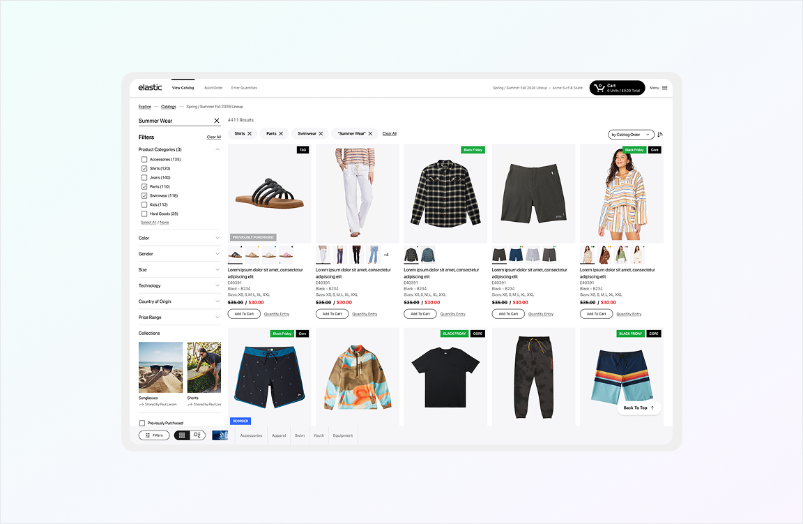
Fig. 01 — Redesigned product discovery experience
Overview
Challenge
Replace limited product strip with scalable catalog and detail pages
My Contribution
UX strategy, information architecture, interaction design, responsive design
Outcome
Familiar catalog behavior, scalable media/availability, operational detail page
Strategic Context
The original experience felt outdated and made product discovery unnecessarily challenging. The catalog was presented as a bottom bar with only product images, limiting visibility and forcing users to browse and access product information within the same surface.
The redesign introduced a proper catalog and detail-page model, reducing friction and aligning the product more closely with familiar commerce behavior while preserving B2B power-user needs.
From Bottom Bar to Catalog
Dedicated listing and detail pages
Faster Workflows
Streamlined evaluation and ordering
Scalable Structure
Variable media and attributes
The Challenge
The Problem
The old experience relied on a bottom product bar instead of a dedicated listing and detail flow. As product complexity increased—including variable media (images, video, 3D, 360 view), variable brand attributes, and high-density availability structures—this pattern became too limiting.
The new system had to support all of this complexity while remaining clear and usable. It needed to balance familiar e-commerce interaction models with B2B power-user workflows.
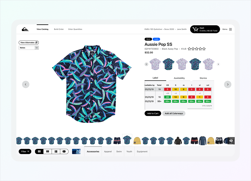
Fig. 02 — Old product Bar experience
My Key Contributions
UX Strategy
Defined product direction from browsing pattern to commerce system, balancing familiar patterns with B2B operational depth
Research & Synthesis
Analyzed media variability, availability density, and B2B workflows to understand maximum complexity the system needed to support
Information Architecture
Structured catalog hierarchy, detail page layout, filters, media gallery, and availability matrix to support variable product complexity
Interaction Design
Designed high-fidelity flows for listing, detail, media modal, availability entry, notes, and operational workflows
Discovery Experience
Product Listing Page
The redesigned catalog browsing experience with filtering, sorting, and quick-action capabilities
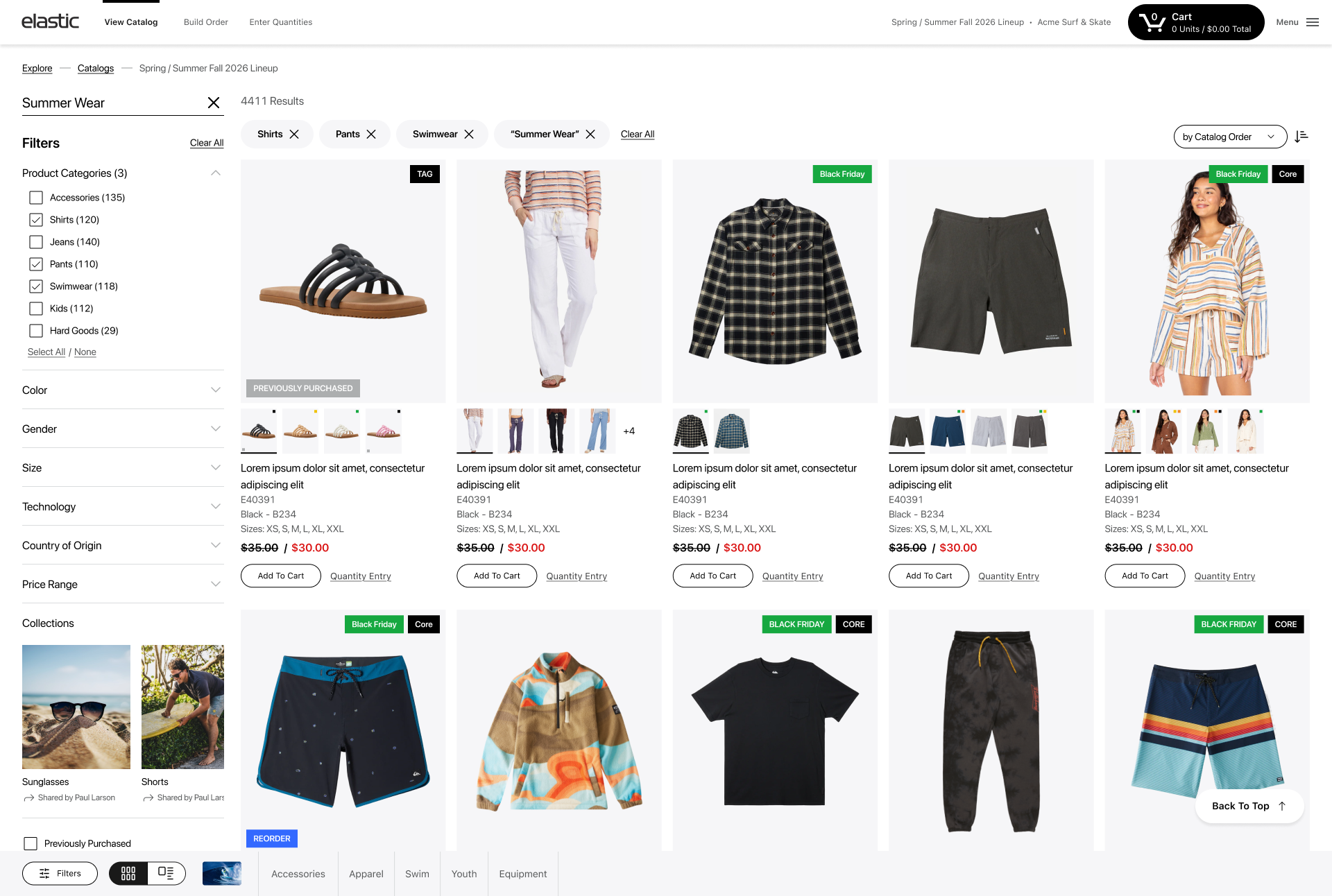
Fig. 03 — Product listing with filters and product cards
Universal Filters
Consistent filtering structure across brands
Product Cards
Colors, highlights, and key attributes at a glance
Sorting & Structure
Flexible browsing and organization options
Quick Add to Cart
Quantity entry directly from listing view
Design Solutions
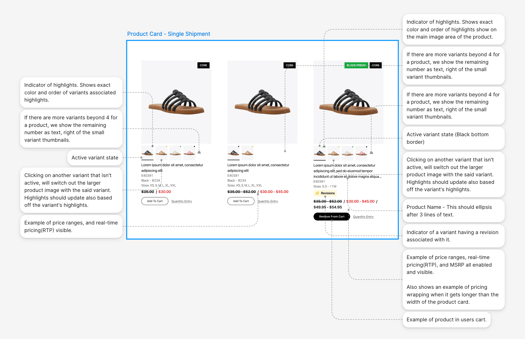
Fig. 06 — Product Card Structure
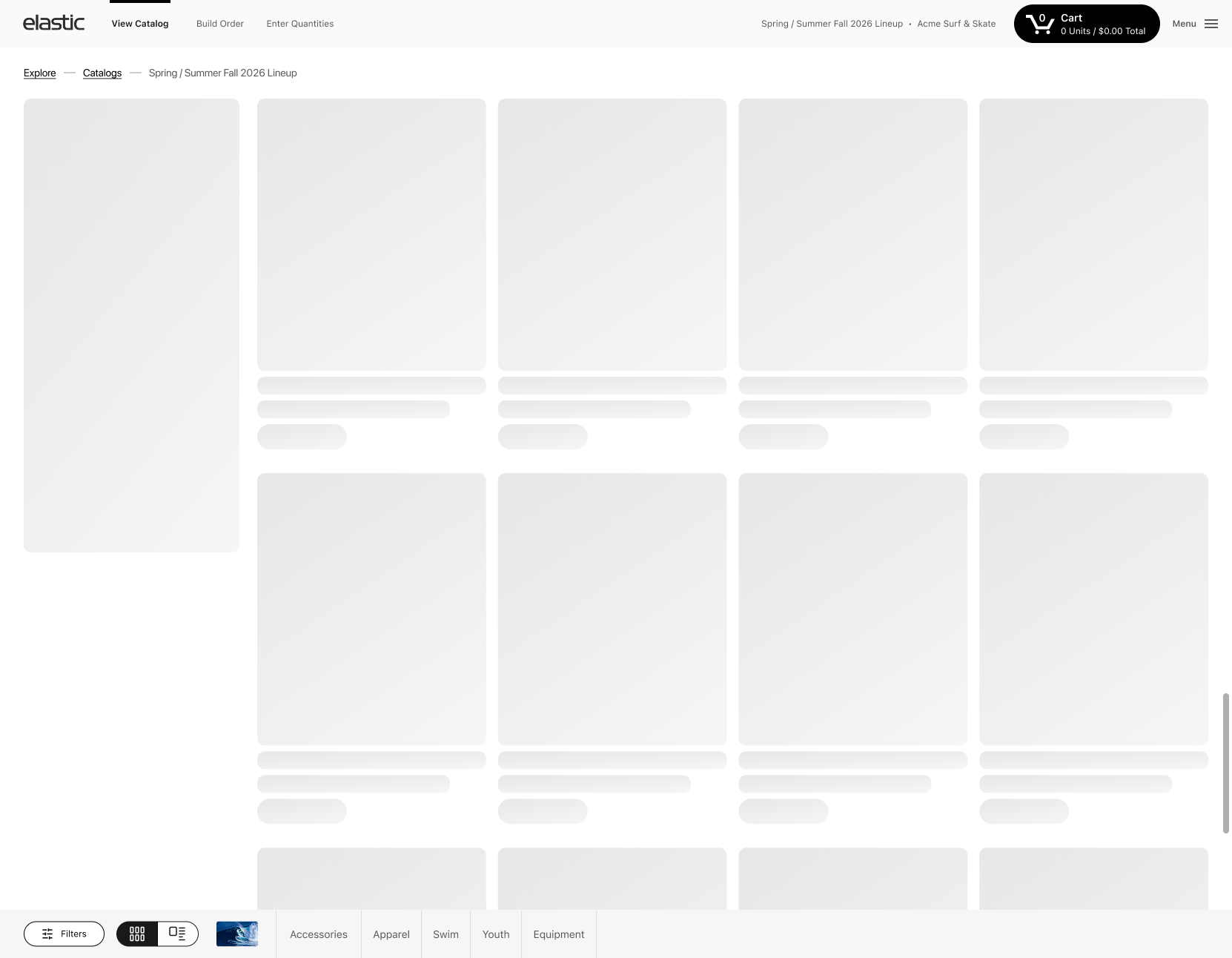
Fig. 04 — Product listing - Skeleton Loading
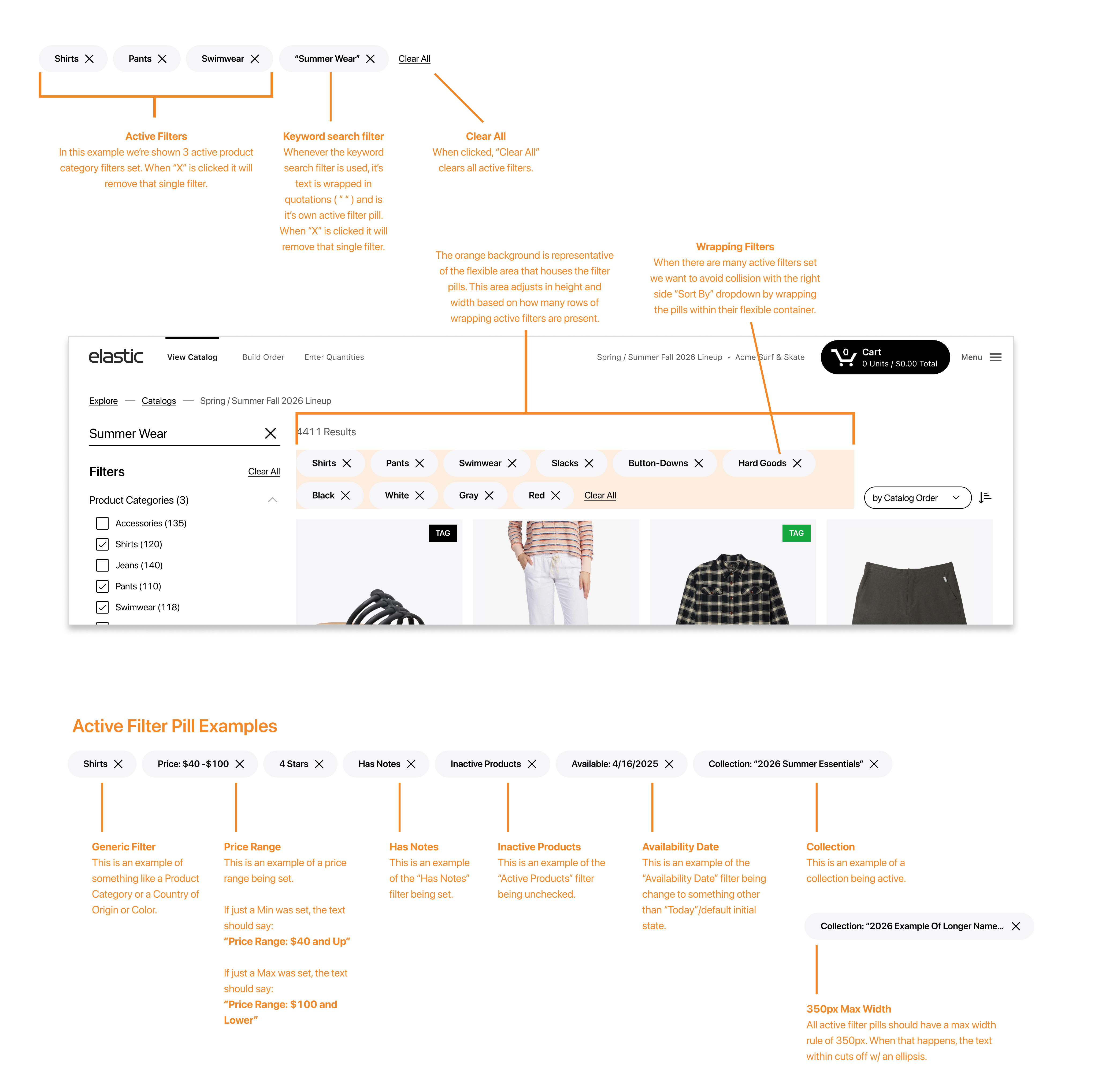
Fig. 05 — Product listing - Active Filter Pill Indicators
Research Insights
I researched how much media and availability density the page might need to support, explored maximum variation in sizes, colors, and quantity-entry scenarios, and studied how users browse, compare, and order in B2B contexts.
Key insights included understanding which detail-page actions were operationally important, listing behavior expectations, add-to-cart patterns, and modal use cases for high-density information.
Media Variability
From one image to video, 3D, 360 view
Complex Availability
Multiple size systems and future dates
Quantity Entry
Direct entry inside availability matrices
B2B Workflows
Shipments, bundles, notes, collaboration
Evaluation Workspace
Product Details Page
The Product Detail Page became the central space for evaluating product media, variations, attributes, availability, notes, bundles, shipments, and ordering actions.
It needed to support everything from simple single-image products to complex multi-variant catalogs with rich media, extensive availability matrices, and operational workflows.
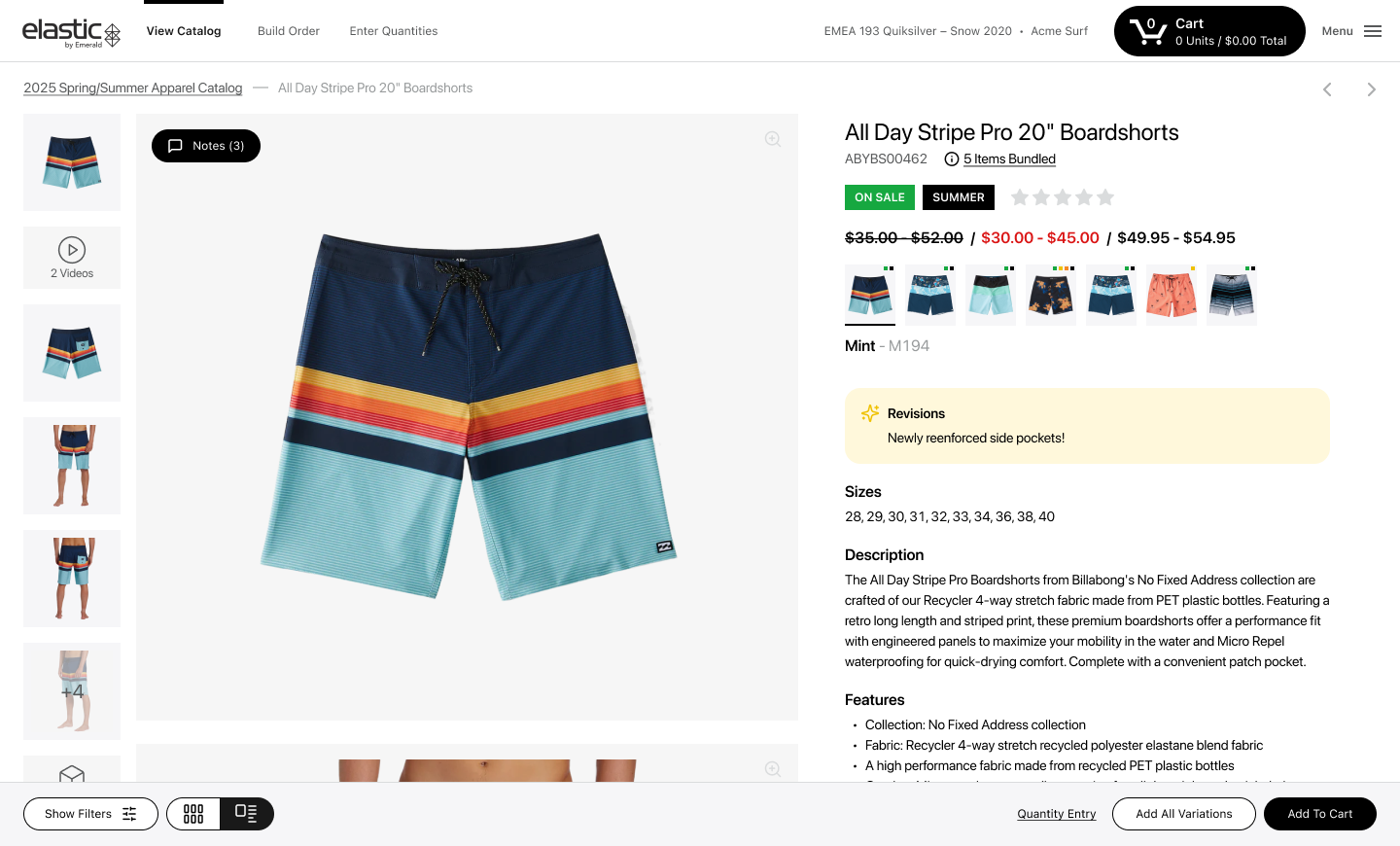
Fig. 07 — Redesigned product detail page overview
Key Decision 01
Designing for Flexible Product Media
A product could have one image or a rich media set including photos, video, 3D, and 360 view. The redesign introduced a flexible gallery and an expanded media modal where users could browse assets, switch colors, move between products, review key product information and add to cart even if there are multiple shipments exist.
The media modal became a powerful workspace where users could explore product details without losing context or needing to navigate back and forth.
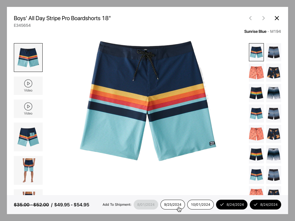
Fig. 08 — Product media gallery
Key Decision 02
Designing Availability for High-Density B2B Ordering
Creating a scalable system that supports multiple size models, date-based availability, and direct quantity entry while remaining usable from low to high density states
Multiple Size Models
Different size systems across product categories
Date-Based Availability
Future delivery dates with varying stock levels
Quantity in Cells
Direct entry inside availability matrices
Density Scalability
Works for both simple and complex products
Multiple Warehouses
Supports multiple locations with varying stock
Purchase Rules
Support minimum, maximum, and multiple qty requirements
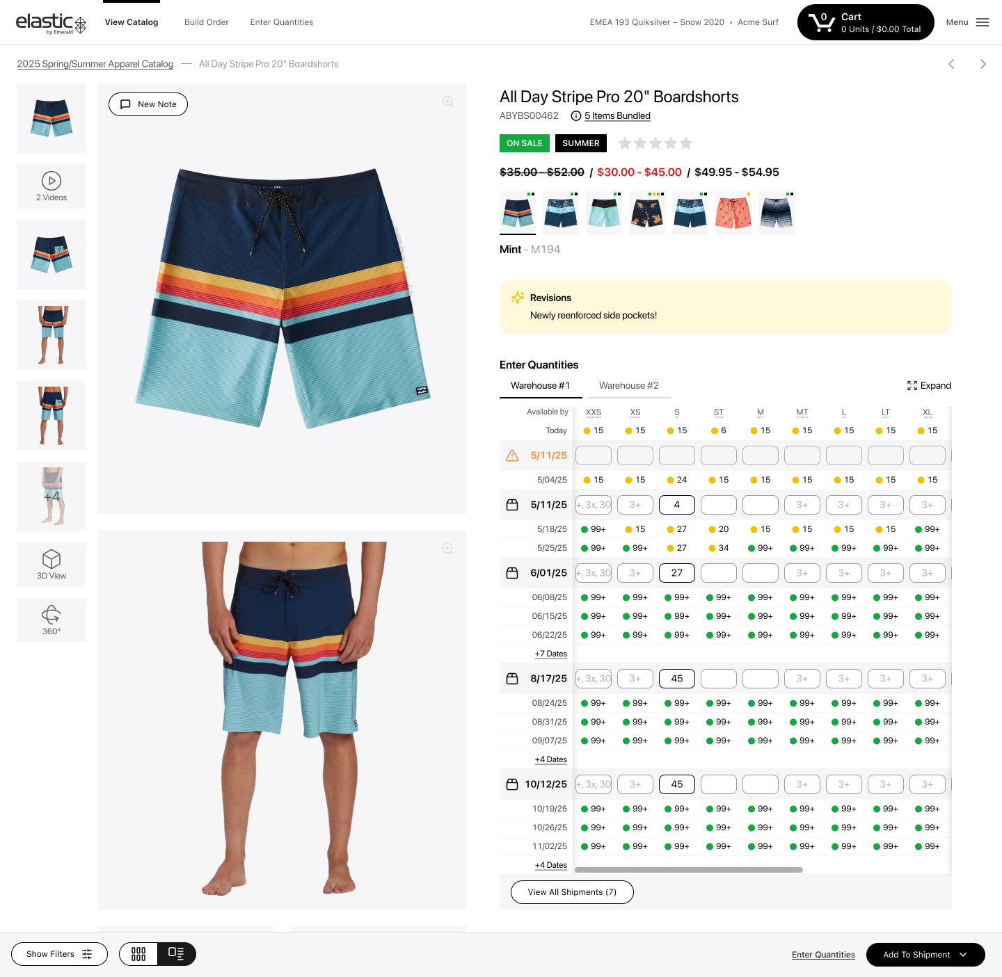
Fig. 9 — Availability high-density mockup
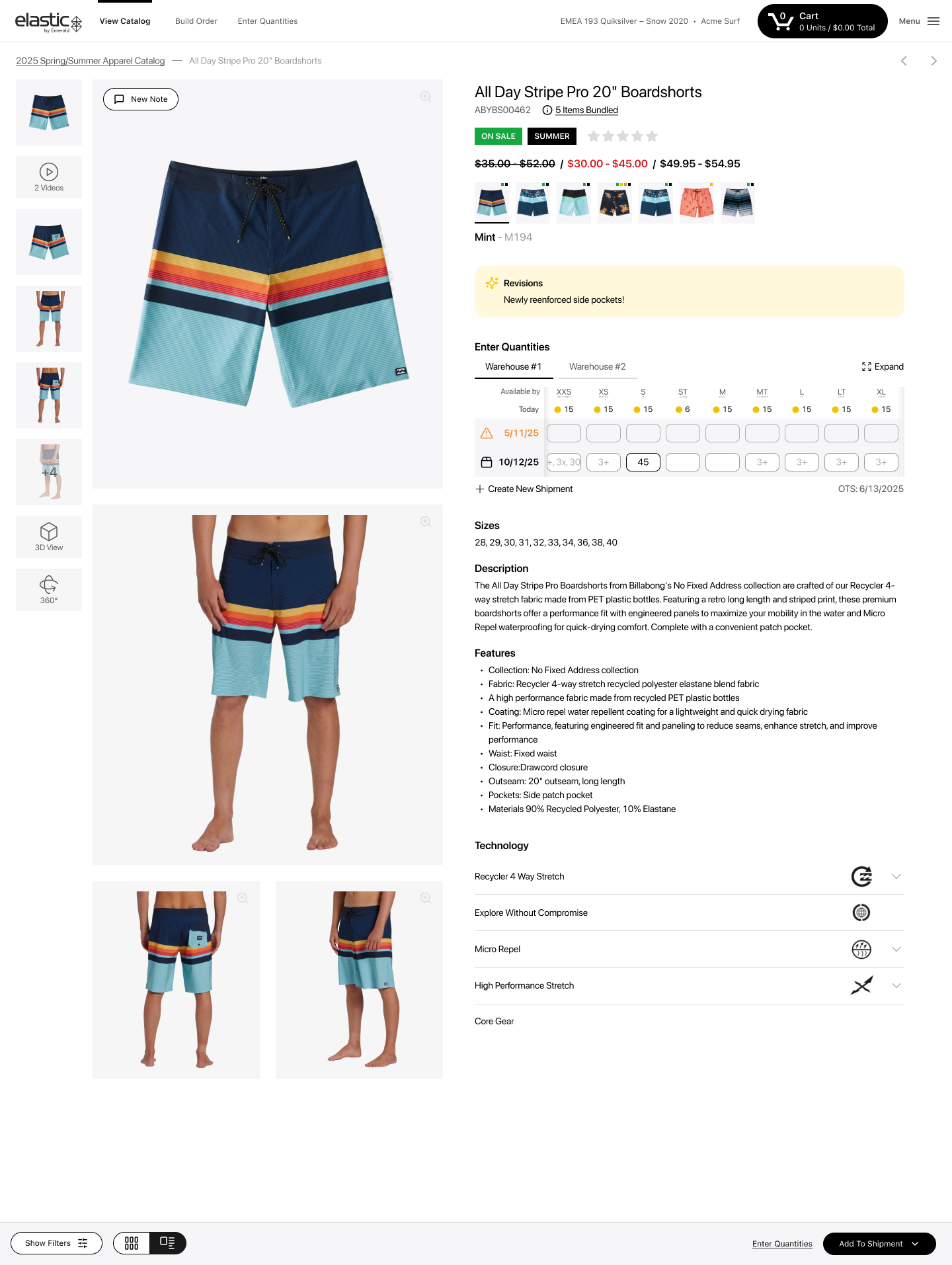
Fig. 10 — Availability matrix with low density
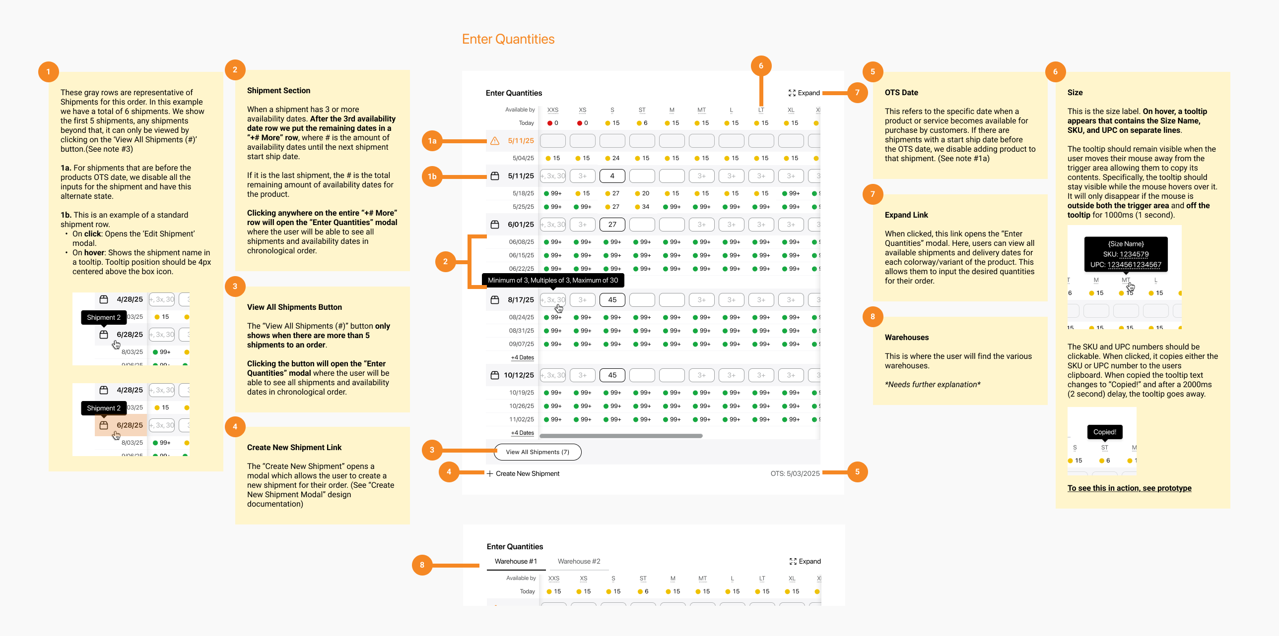
Fig. 11 — Availability with size/date matrix
Flexible Product Information
Across brands, the page consistently supports core information such as product name, product number, images, colors, and color code, while deeper content such as features, annotations, and technology is structured progressively.
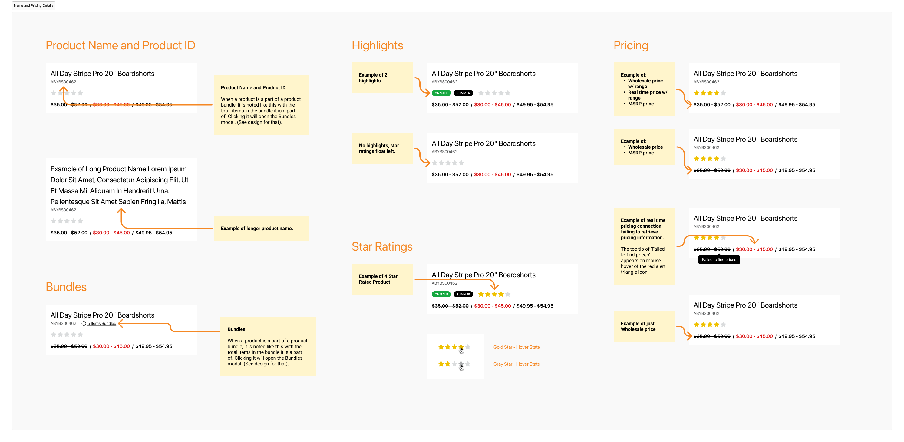
Fig. 12 — Product information structure
Collaboration
Notes: From Separate Buckets to a Shared Conversation
Notes were previously divided into rep notes, dealer notes, and my notes. The redesign combined them into a more conversational thread-like experience where users could read and leave notes in a clearer and more collaborative way.
This improved visibility into product-level communication and reduced confusion about where information lived.
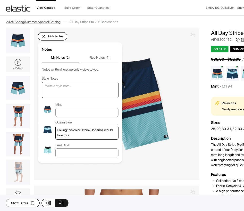
Fig. 13 — Redesigned notes thread
Designing for complex B2B shipment flows
Unlike a typical B2C flow, this B2B product details page needed to support adding a single product to multiple shipments. To keep the interface scalable, shipment actions were shown as buttons when space allowed, and converted into a dropdown when the number of shipments exceeded the available screen space, while preserving the same information and interaction logic.
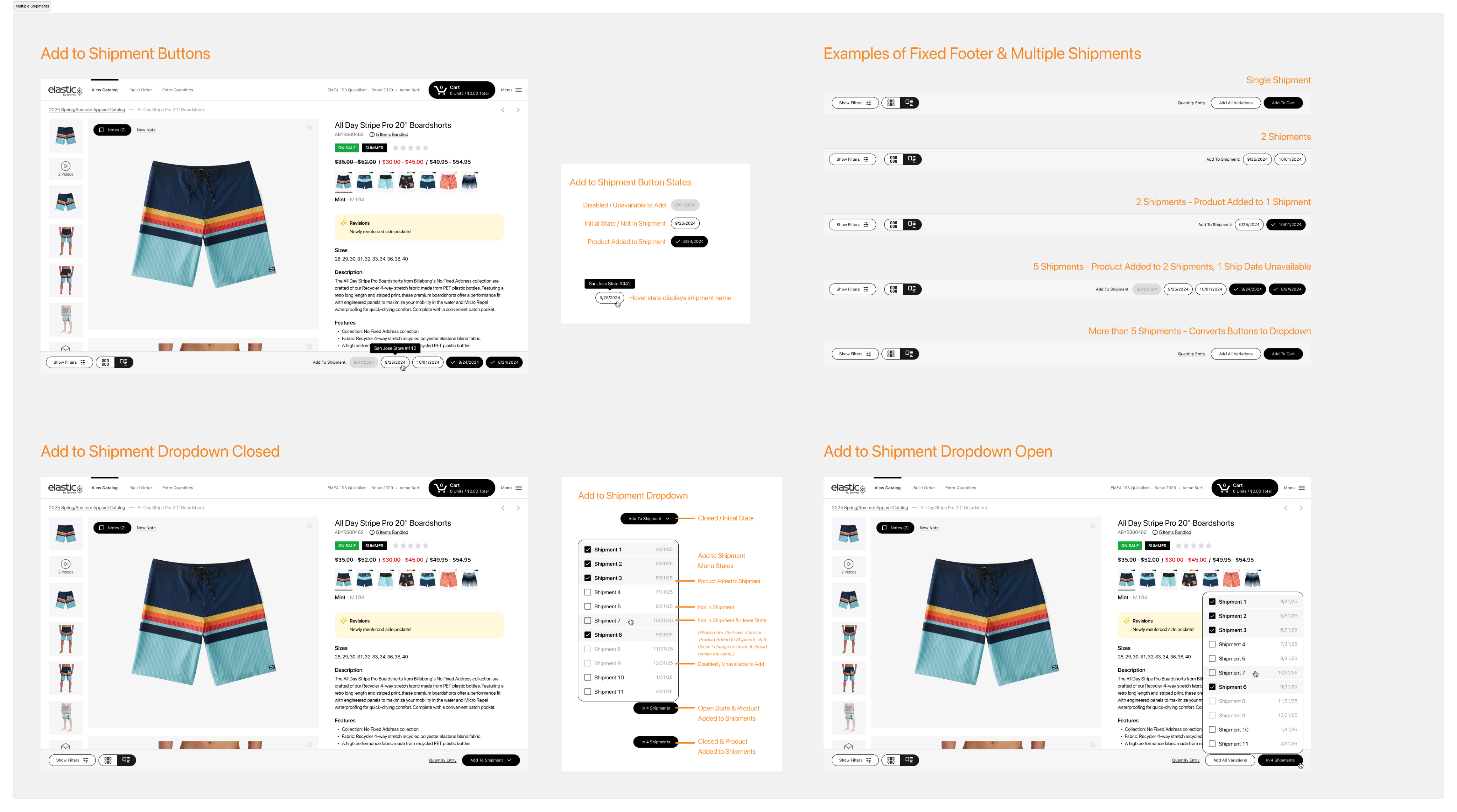
Fig. 14 — Product listing - Skeleton Loading
Responsive Adaptation
The mobile experience remained functionally strong while adapting the detail and shopping workflows for smaller screens. The interface was simplified visually without losing core behaviors such as media review, availability, notes, and add to cart.
Fig. 15 — Mobile listing
(live)
Product Listing Page & Detail

Fig. 16 — Almost Final Live
Familiar Catalog
Dedicated listing and detail pages
Scalable Media
Variable asset support
Powerful Availability
High-density ordering
Operational Detail
Action from context
Reflection
Testimonials and Results

All Hands Meeting Demo!
You might ask why I took a photo on my phone instead of a screenshot… honestly, I don’t know... I was just so happy.
Result
Platform serves 20,000 daily users worldwide. After upgrade nearly 48% reach checkout, with an average of 3–30 minutes spent on site. Based on orders vs. time, this equates to roughly one order for every minute a user spends on the site.

Previous Case
Next Case
Case Study
Redesign Product Discovery & Details
Transforming a limited B2B product strip into a scalable commerce experience for discovery, evaluation, and action
Role
Lead Product Designer
Team
Design, Engineering, Product
Tools
Figma, Amplitude
Timeline
2023 – 2025
Scope
Full Redesign
Fig. 01 — Redesigned product discovery experience
Overview
Challenge
Replace limited product strip with scalable catalog and detail pages
My Contribution
UX strategy, information architecture, interaction design, responsive design
Outcome
Familiar catalog behavior, scalable media/availability, operational detail page
Strategic Context
The original experience felt outdated and made product discovery unnecessarily challenging. The catalog was presented as a bottom bar with only product images, limiting visibility and forcing users to browse and access product information within the same surface.
The redesign introduced a proper catalog and detail-page model, reducing friction and aligning the product more closely with familiar commerce behavior while preserving B2B power-user needs.
From Bottom Bar to Catalog
Dedicated listing and detail pages
Faster Workflows
Streamlined evaluation and ordering
Scalable Structure
Variable media and attributes
The Challenge
The Problem
The old experience relied on a bottom product bar instead of a dedicated listing and detail flow. As product complexity increased—including variable media (images, video, 3D, 360 view), variable brand attributes, and high-density availability structures—this pattern became too limiting.
The new system had to support all of this complexity while remaining clear and usable. It needed to balance familiar e-commerce interaction models with B2B power-user workflows.
Fig. 02 — Old product Bar experience
My Key Contributions
UX Strategy
Defined product direction from browsing pattern to commerce system, balancing familiar patterns with B2B operational depth
Research & Synthesis
Analyzed media variability, availability density, and B2B workflows to understand maximum complexity the system needed to support
Information Architecture
Structured catalog hierarchy, detail page layout, filters, media gallery, and availability matrix to support variable product complexity
Interaction Design
Designed high-fidelity flows for listing, detail, media modal, availability entry, notes, and operational workflows
Updated Experience
Product Listing Page
The redesigned catalog browsing experience with filtering, sorting, and quick-action capabilities
Fig. 03 — Product listing with filters and product cards
Universal Filters
Consistent filtering structure across brands
Product Cards
Colors, highlights, and key attributes at a glance
Sorting & Structure
Flexible browsing and organization options
Quick Add to Cart
Quantity entry directly from listing view
Design Solutions
Fig. 06 — Product Card Structure
Fig. 04 — Product listing - Skeleton Loading
Fig. 05 — Product listing - Active Filter Pill Indicators
Research Insights & Design Strategy
I researched how much media and availability density the page might need to support, explored maximum variation in sizes, colors, and quantity-entry scenarios, and studied how users browse, compare, and order in B2B contexts.
Key insights included understanding which detail-page actions were operationally important, listing behavior expectations, add-to-cart patterns, and modal use cases for high-density information.
Media Variability
From one image to video, 3D, 360 view
Complex Availability
Multiple size systems and future dates
Quantity Entry
Direct entry inside availability matrices
B2B Workflows
Shipments, bundles, notes, collaboration
Evaluation Workspace
Product Details Page
The Product Detail Page became the central space for evaluating product media, variations, attributes, availability, notes, bundles, shipments, and ordering actions.
It needed to support everything from simple single-image products to complex multi-variant catalogs with rich media, extensive availability matrices, and operational workflows.
Fig. 07 — Redesigned product detail page overview
Key Decision 01
Designing for Flexible Product Media
A product could have one image or a rich media set including photos, video, 3D, and 360 view. The redesign introduced a flexible gallery and an expanded media modal where users could browse assets, switch colors, move between products, review key product information and add to cart even if there are multiple shipments exist.
The media modal became a powerful workspace where users could explore product details without losing context or needing to navigate back and forth.
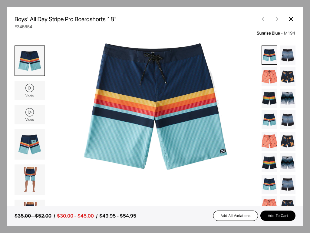
Fig. 08 — Product media gallery - single shipment
Fig. 09 — Media modal several shipments
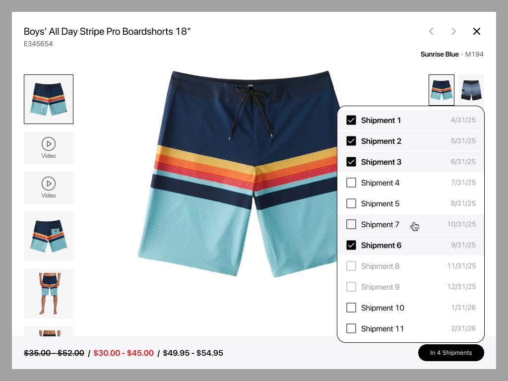
Fig. 10 — Media modal with a lot of shipments
Key Decision 02
Designing Availability for High-Density B2B Ordering
Creating a scalable system that supports multiple size models, date-based availability, and direct quantity entry while remaining usable from low to high density states
Multiple Size Models
Different size systems across product categories
Date-Based Availability
Future delivery dates with varying stock levels
Quantity in Cells
Direct entry inside availability matrices
Density Scalability
Works for both simple and complex products
Multiple Warehouses
Supports multiple locations with varying stock
Purchase Rules
Support minimum, maximum, and multiple qty requirements
Fig. 11 — Availability high-density mockup
Fig. 12 — Availability matrix with low density
Fig. 13 — Availability with size/date matrix
Flexible Product Information
Across brands, the page consistently supports core information such as product name, product number, images, colors, and color code, while deeper content such as features, annotations, and technology is structured progressively.
Fig. 14 — Product information structure
Collaboration
Notes: From Separate Buckets to a Shared Conversation
Notes were previously divided into rep notes, dealer notes, and my notes. The redesign combined them into a more conversational thread-like experience where users could read and leave notes in a clearer and more collaborative way.
This improved visibility into product-level communication and reduced confusion about where information lived.
Fig. 15 — Redesigned notes thread
Designing for complex B2B shipment flows
Unlike a typical B2C flow, this B2B product details page needed to support adding a single product to multiple shipments. To keep the interface scalable, shipment actions were shown as buttons when space allowed, and converted into a dropdown when the number of shipments exceeded the available screen space, while preserving the same information and interaction logic.
Fig. 16 — Product listing - Skeleton Loading
Responsive Adaptation
The mobile experience remained functionally strong while adapting the detail and shopping workflows for smaller screens. The interface was simplified visually without losing core behaviors such as media review, availability, notes, and add to cart.
Fig. 17 — Mobile listing
(live)
Product Listing Page & Detail
Fig. 18 — Almost Final Live
Familiar Catalog
Dedicated listing and detail pages
Scalable Media
Variable asset support
Powerful Availability
High-density ordering
Operational Detail
Action from context
Reflection
Testimonials and Results
All Hands Meeting Demo!
You might ask why I took a photo on my phone instead of a screenshot… honestly, I don’t know... I was just so happy.
Result
Platform serves 20,000 daily users worldwide. After upgrade nearly 48% reach checkout, with an average of 3–30 minutes spent on site. Based on orders vs. time, this equates to roughly one order for every minute a user spends on the site.

Get in Touch
Previous Case
Next Case
Case Study
Redesign Product
Discovery & Detail
Transforming a limited product strip into a scalable commerce experience that combines the familiarity of B2C with the functionality of B2B
Role
Product Designer
Team
Design, Engineering, Product
Tools
Figma, Amplitude
Timeline
2023 – 2025
Scope
Full Redesign
Fig. 01 — Redesigned product discovery experience
Overview
Challenge
Replace limited product strip with scalable catalog and detail pages
My Contribution
UX strategy, information architecture, interaction design, responsive design
Outcome
Familiar catalog behavior, scalable media/availability, operational detail page
Strategic Context
The original experience felt outdated and made product discovery unnecessarily challenging. The catalog was presented as a bottom bar with only product images, limiting visibility and forcing users to browse and access product information within the same surface.
The redesign introduced a proper catalog and detail-page model, reducing friction and aligning the product more closely with familiar commerce behavior while preserving B2B power-user needs.
From Bottom Bar to Catalog
Dedicated listing and detail pages
Faster Workflows
Streamlined evaluation and ordering
Scalable Structure
Variable media and attributes
The Challenge
The Problem
The old experience relied on a bottom product bar instead of a dedicated listing and detail flow. As product complexity increased: including variable media (images, video, 3D, 360 view), variable brand attributes, and high-density availability structures - this pattern became too limiting.
The new system had to support all of this complexity while remaining clear and usable. It needed to balance familiar e-commerce interaction models with B2B power-user workflows.
Fig. 02 — Old product Bar experience
My Key
Contributions
UX Strategy
Defined product direction from browsing pattern to commerce system, balancing familiar patterns with B2B operational depth
Research & Synthesis
Analyzed media variability, availability density, and B2B workflows to understand maximum complexity the system needed to support
Information Architecture
Structured catalog hierarchy, detail page layout, filters, media gallery, and availability matrix to support variable product complexity
Interaction Design
Designed high-fidelity flows for listing, detail, media modal, availability entry, notes, and operational workflows
Updated Experience
Product Listing Page
The redesigned catalog browsing experience with filtering, sorting, and quick-action capabilities
Fig. 03 — Product listing with filters and product cards
Universal Filters
Consistent filtering structure across brands with ability to customisation
Product Cards
Colors, highlights, and key attributes at a glance
Sorting & Structure
Flexible browsing and organization options
Quick Add to Cart
Quantity entry directly from listing view
Design Solutions
Fig. 06 — Product Card Structure
Fig. 04 — Product listing - Skeleton Loading
Fig. 05 — Product listing - Active Filter Pill Indicators
Research Insights and Design Strategy
I researched how much media and availability density the page might need to support, explored maximum variation in sizes, colors, and quantity-entry scenarios, and studied how users browse, compare, and order in B2B contexts.
Key insights included understanding which detail-page actions were operationally important, listing behavior expectations, add-to-cart patterns, and modal use cases for high-density information.
Media Variability
From no image to multiple, videos, 3D, 360 view
Complex Availability Inputs
Multiple size systems and future dates
Quantity Entry
Direct entry inside availability matrices
B2B Workflows
Shipments, bundles, notes, collaboration
Updated Product Details Page
Product Details Page
The Product Detail Page became the central space for evaluating product media, variations, attributes, availability, notes, bundles, shipments, and ordering actions.
It needed to support everything from simple single-image products to complex multi-variant catalogs with rich media, extensive availability matrices, and operational workflows.
Fig. 07 — Redesigned product detail page overview
Key Decision 01
Designing for Flexible Product Media
A product could have one image or a rich media set including photos, video, 3D, and 360 view. The redesign introduced a flexible gallery and an expanded media modal where users could browse assets, switch colors, move between products, review key product information and add to cart even if there are multiple shipments exist.
The media modal became a powerful workspace where users could explore product details without losing context or needing to navigate back and forth.
Fig. 08 — Product media gallery - single shipment
Fig. 09 — Media modal several shipments
Fig. 10 — Media modal with a lot of shipments
Key Decision 02
Designing Availability for High-Density B2B Ordering
Creating a scalable system that supports multiple size models, date-based availability, and direct quantity entry while remaining usable from low to high density states
Multiple Size Models
Different size systems across product categories
Date-Based Availability
Future delivery dates with varying stock levels
Quantity in Cells
Direct entry inside availability matrices
Density Scalability
Works for both simple and complex products
Multiple Warehouses
Supports multiple locations with varying stock
Purchase Rules
Support minimum, maximum, and multiple qty requirements
Fig. 11 — Availability high-density mockup
Fig. 12 — Availability matrix with low density
Fig. 13 — Availability with size/date matrix
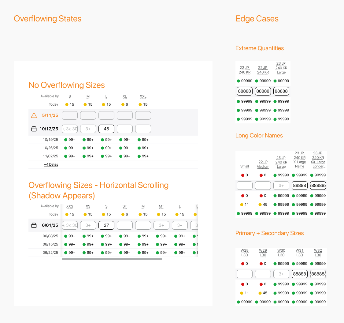
Fig. 14 — Overflowing States and Edge Cases
supporting features
Flexible Product Information
Across brands, the page was built to accommodate different levels of product information. Core details such as product name, product number, images, colors, and color code could be shown when available, while deeper content like features, annotations, and technology appeared progressively and, in some cases, was not present at all.
Fig. 15 — Product information structure
Collaboration
Notes: From Separate Buckets to a Shared Conversation
Notes were previously divided into rep notes, dealer notes, and my notes. The redesign combined them into a more conversational thread-like experience where users could read and leave notes in a clearer and more collaborative way.
This improved visibility into product-level communication and reduced confusion about where information lived by allowing users to leave notes both at the overall product level and, when needed, separately for individual product colors.
Fig. 16 — Redesigned notes thread
Designing for complex B2B shipment flows
Unlike a typical B2C flow, this B2B product details page needed to support adding a single product to multiple shipments. To keep the interface scalable, shipment actions were shown as buttons when space allowed, and converted into a dropdown when the number of shipments exceeded the available screen space, while preserving the same information and interaction logic.
Fig. 17 — Multiple shipment actions as buttons and dropdown
Responsive Adaptation
The mobile experience remained functionally strong while adapting the detail and shopping workflows for smaller screens. The interface was simplified visually without losing core behaviors such as media review, availability, notes, and add to cart.
Fig. 18 — Mobile listing
(live)
Product Listing Page & Detail
Fig. 19 — Almost Final Live
Familiar Catalog
Dedicated listing and detail pages
Scalable Media
Variable asset support
Powerful Availability
High-density ordering
Operational Detail
Action from context
Reflection
Testimonials and Results
All Hands Meeting Demo!
You might ask why I took a photo on my phone instead of a screenshot… honestly, I don’t know... I was just so happy.
Result
Platform serves 20,000 daily users worldwide. After upgrade nearly 48% reach checkout, with an average of 3–30 minutes spent on site. Based on orders vs. time, this equates to roughly one order for every minute a user spends on the site.