
Get in Touch
Case Study
Redesign
Order History
Redesigning a dense B2B order management experience to improve scanability, clarity, and confidence in daily workflows
Role
Product Designer
Team
1 Designer, 3 Engineers, 1 PM
Timeline
Jan 2025 - Feb 2026
Platform
B2B Web Application
My Role
UX strategy, information architecture, interaction design, usability testing
Collaboration
Cross-functional with engineering, product, and business stakeholders
Tools
Figma, Amplitude, Jira, Confluence, CoPilot
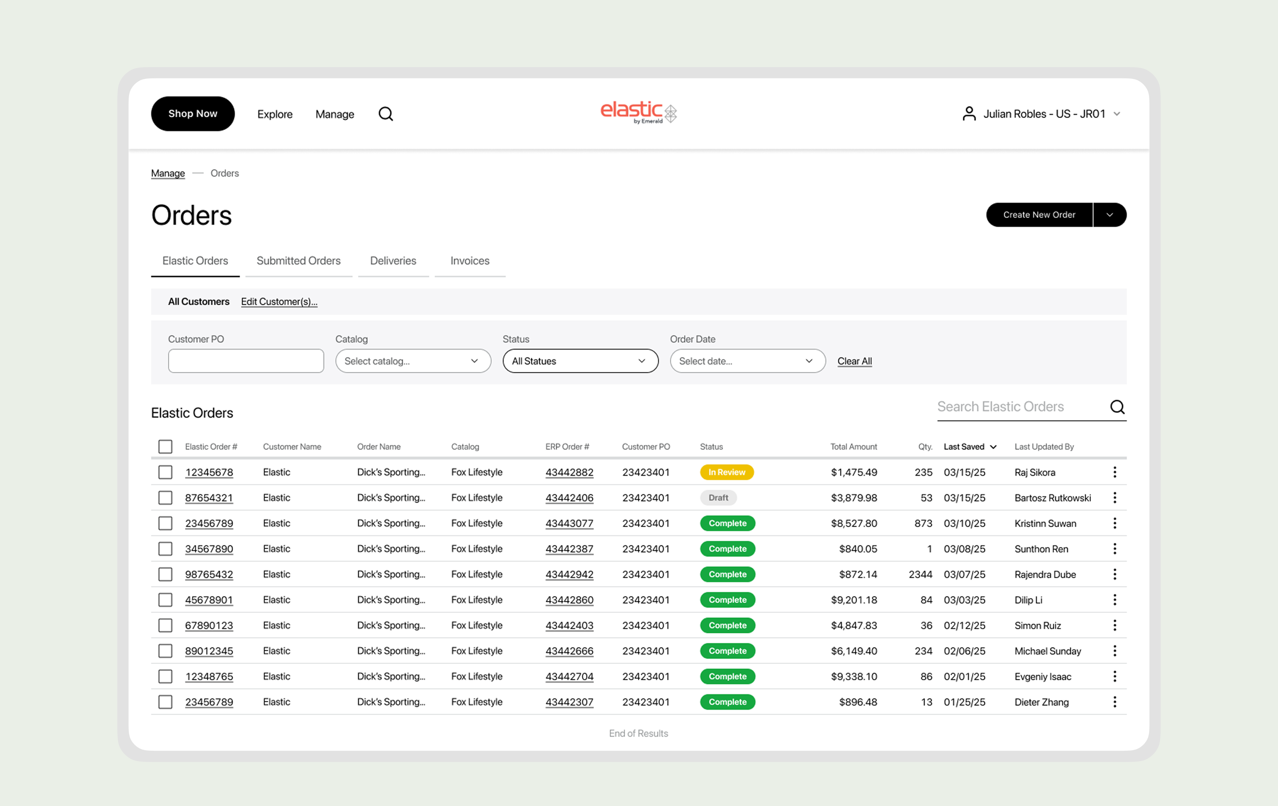
Fig. 01 — Updated order history interface
Key Points
Discovery
Led discovery to define the problem, success metrics, and constraints and Ran a comparative audit of three primary Order History experiences to benchmark filters, scan patterns, exports, and performance, informing v1 scope and the roadmap.
Design Startegy
Unified a single, responsive table component usable across Order Listing and Invoice Listing, supporting dynamic column schemas per client (data availability/permissions), and extended the same pattern principles to Order Detail and Invoice Detail line‑items for consistency.
Collaboration
Partnered with Engineering and PMs to streamline design→dev handoff: documented component specs, annotated empty/error/loading states and wrote acceptance criteria.
Research
Insights
74%
Users needed faster order scanning
45%
Filters created friction
62%
Customer context easy to miss
10-15m
Average search time for order details
The Existing Experience
Original Order History
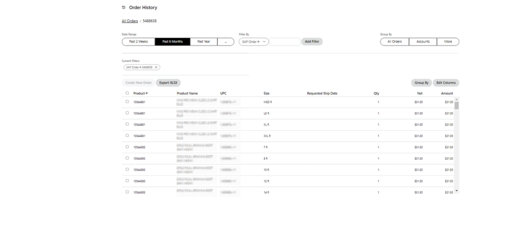
Fig. 02 — Order History - Elastic
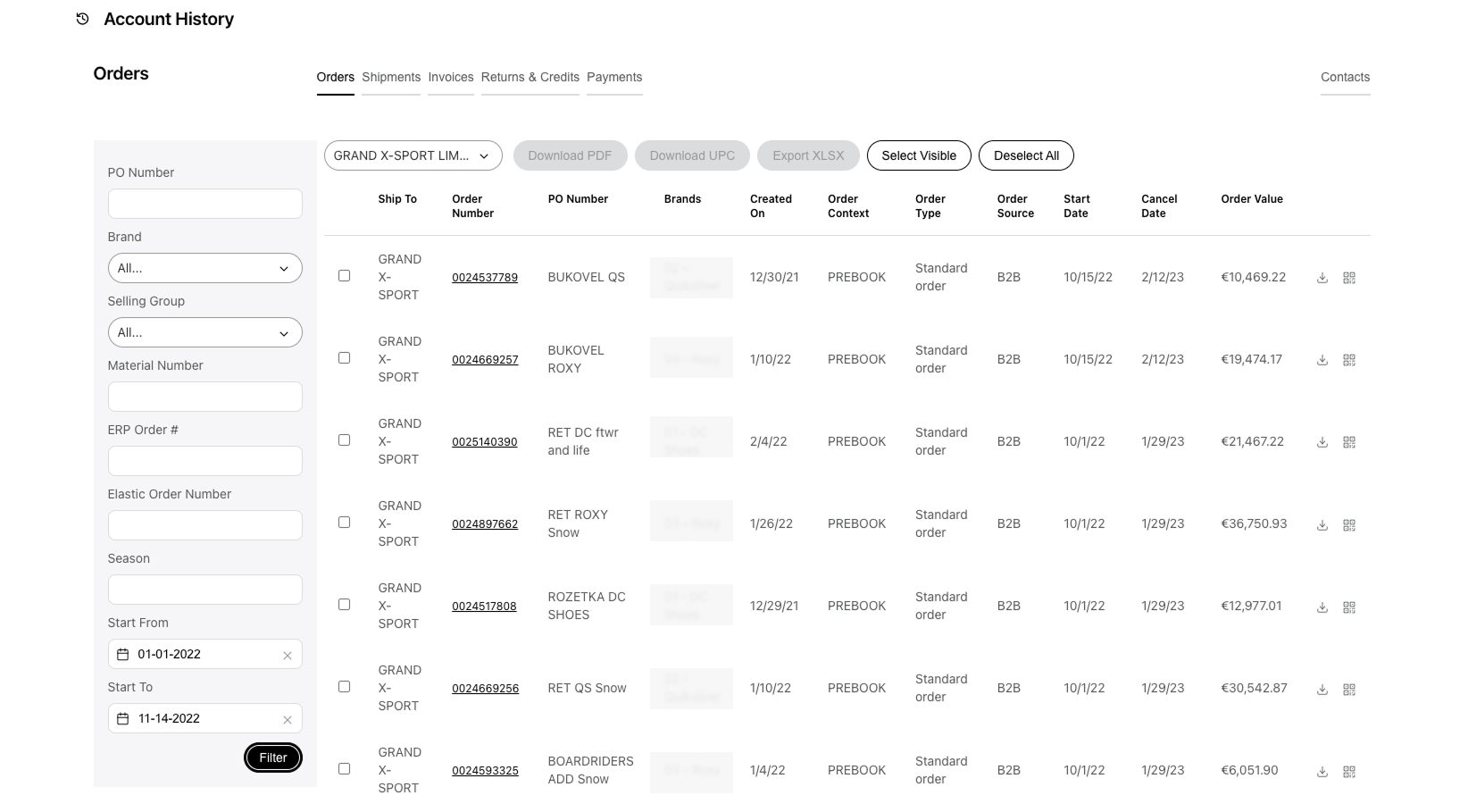
Fig. 03 — Custom Order History for our large Client
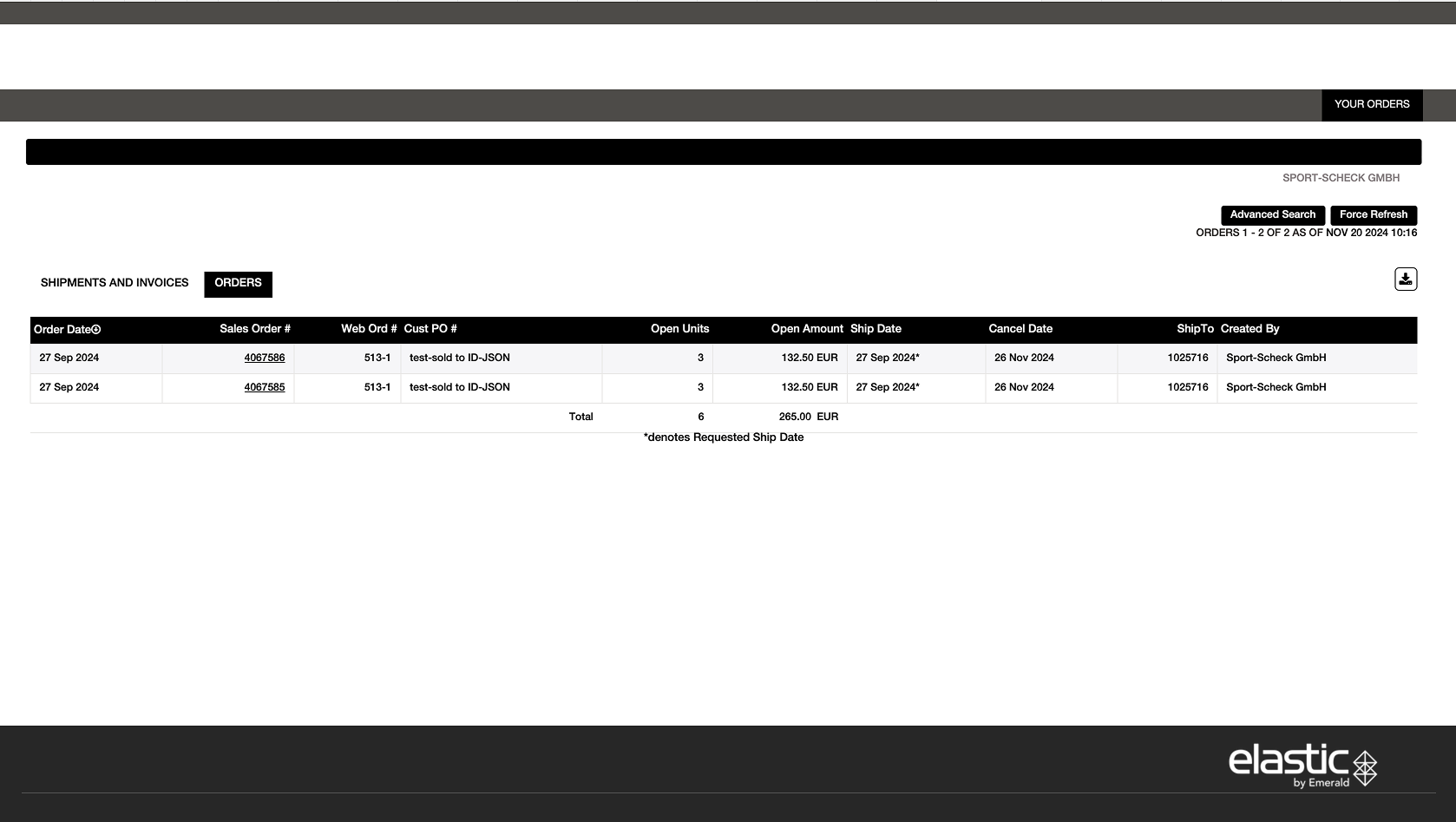
Fig. 04 — Order History - Microsite
Strategy & Approach
Prioritize scanability
Improve visual hierarchy and spacing to support faster information retrieval
Reduce friction in filtering
Clarify filter relationships and active states for confident selection
Make customer context visible
Position customer scope near the work area to prevent errors
Balance clarity with constraints
Ship incremental value while maintaining design quality
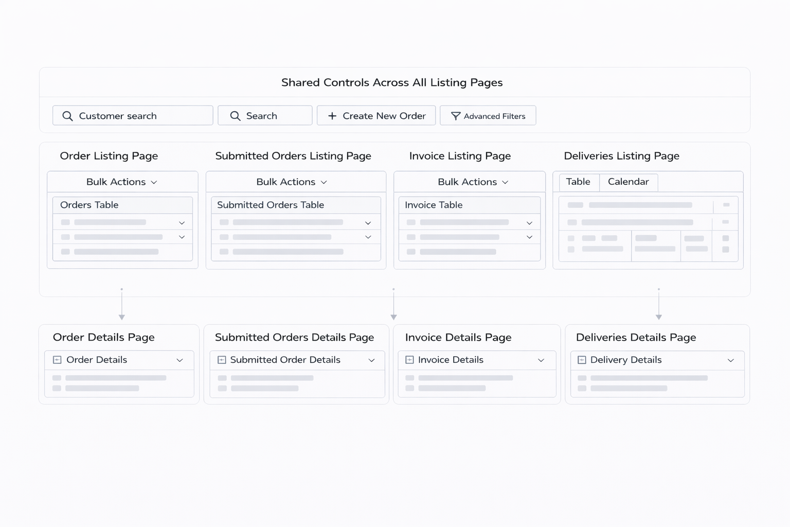
Fig. 05 — Design strategy and prioritization
Scoping & Prioritization
What Shipped in MVP
Ship Now
Table hierarchy improvements
Customer scope repositioning
Filter structure clarity
Status visibility enhancements
Calendar view for deliveries
One Page with Listing for all Orders from different sources
Later Iteration
Custom view saving and templates
Enhanced export capabilities
Inline editing functionality
Design Decisions
Reposition the Customer Selector Bar
Problem
The customer selector originally sat too far from the order table, so users often missed the active customer context and reviewed the wrong customer's orders before correcting their filters. The issue was not only visibility, but also poor proximity to where the task actually happened.
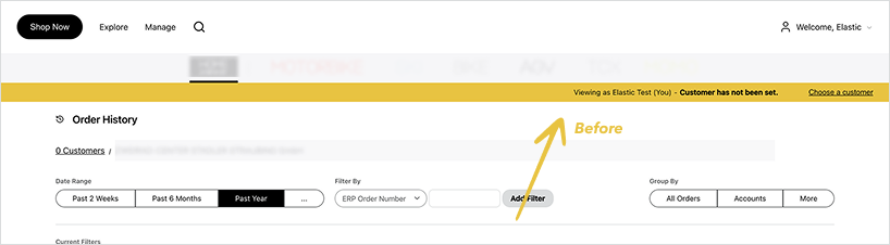
Fig. 06 — Original selector placement issue
Design Constraints:
Selector location
Selector should be part of the filters and be as close to the table as possible
vertical space
Avoid pushing the table below the fold
multiple states
Single, all customers, and multi-customer
mvp
Keep all components from the design system
Options Explored:
Option 01
Inline customer pills

Explicit current scope

Scales poorly
Pushes table downward
Good visibility
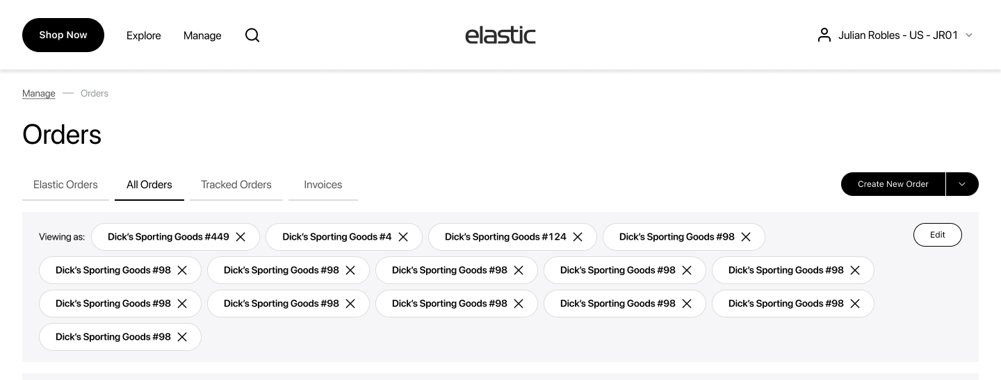
Fig. 07
Option 02
Pills with overflow dropdown
Handles scale better
Reduces overflow
Adds complexity
Mixed discoverability
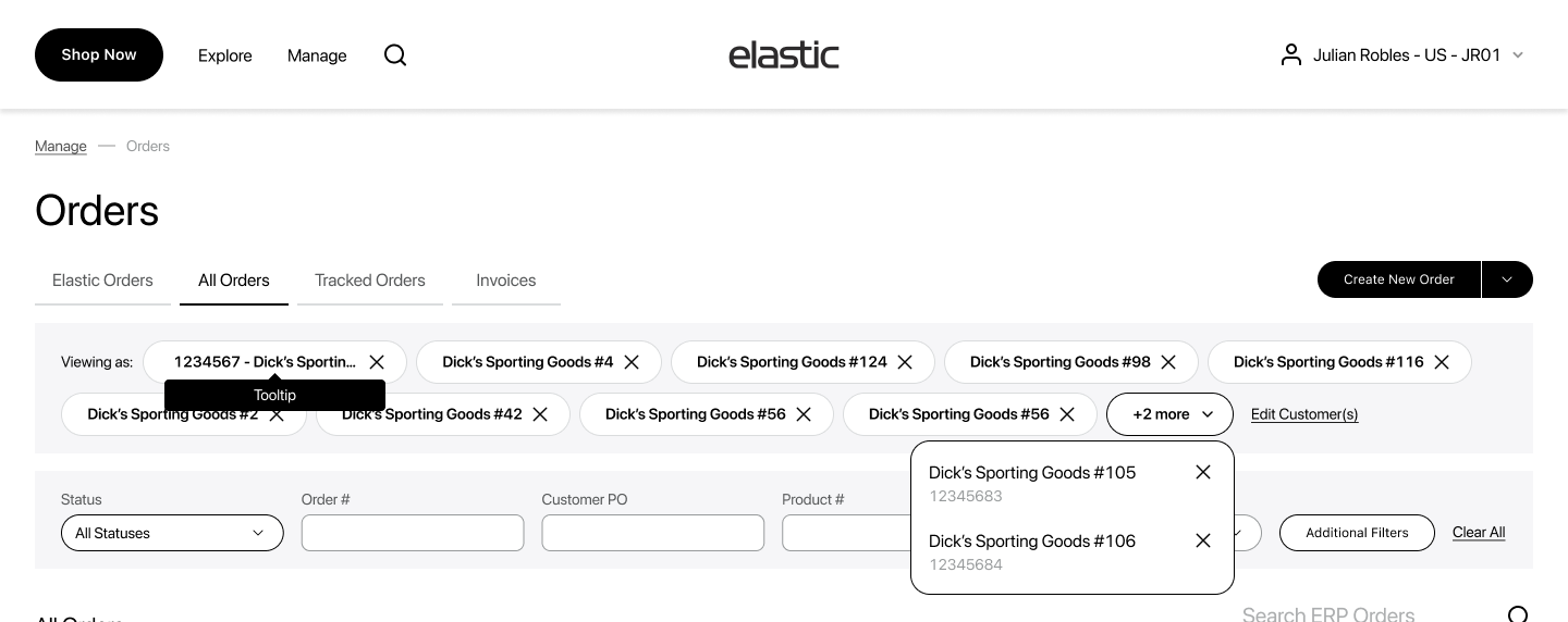
Fig. 08
Final Decision
Thin context bar with modal
Rationale
• Minimal vertical footprint
• Visible near the work area
• Simpler MVP implementation
Introduce a thin context bar directly above the table and near the filters. Keep the surface minimal while moving richer customer-selection interactions into a modal for MVP. This preserves vertical space, improves visibility at the point of use, and supports multiple customer states without introducing a heavy inline component.
Fig. 09 — Final selected solution
Design Decisions
Filters
Design Constraints:
Multi‑brand variability
Each brand can expose a different set and count of data columns/fields → filters must adapt to available data and permissions.
Keep the table visible
Order table should remain as high as possible; we cannot afford a tall filter block eating vertical space.
Speed first
Users need quick filters for 80–90% of lookups; deeper filters should serve exceptional and compound cases.
Design Decisions:
Filters bar + Additional Filters modal
Modal grouped by categories, rendering only filters that match the brand’s schema (dynamic availability by columns/permissions).
Why Modal for Additional Filters?
- Quick chips cover ~80–90% of queries. The modal holds the long-tail fields so the header stays clean.
- On small screens, the modal becomes a slide-up sheet, so same structure, no new layout to learn.
- Room for grouped sections (Order / Payment / Shipping / Customer - could be modified), helper text and date presets, without squeezing controls.
Fig. 10 — Filters and additional filters modal
Design Decisions
Calendar View to Deliveries
Problem
The Deliveries experience originally relied only on a table view. While this worked well for row-level management and detailed review, it did not support time-based planning as effectively. Delivery workflows often require users to think in terms of dates, schedules, and volume across days.
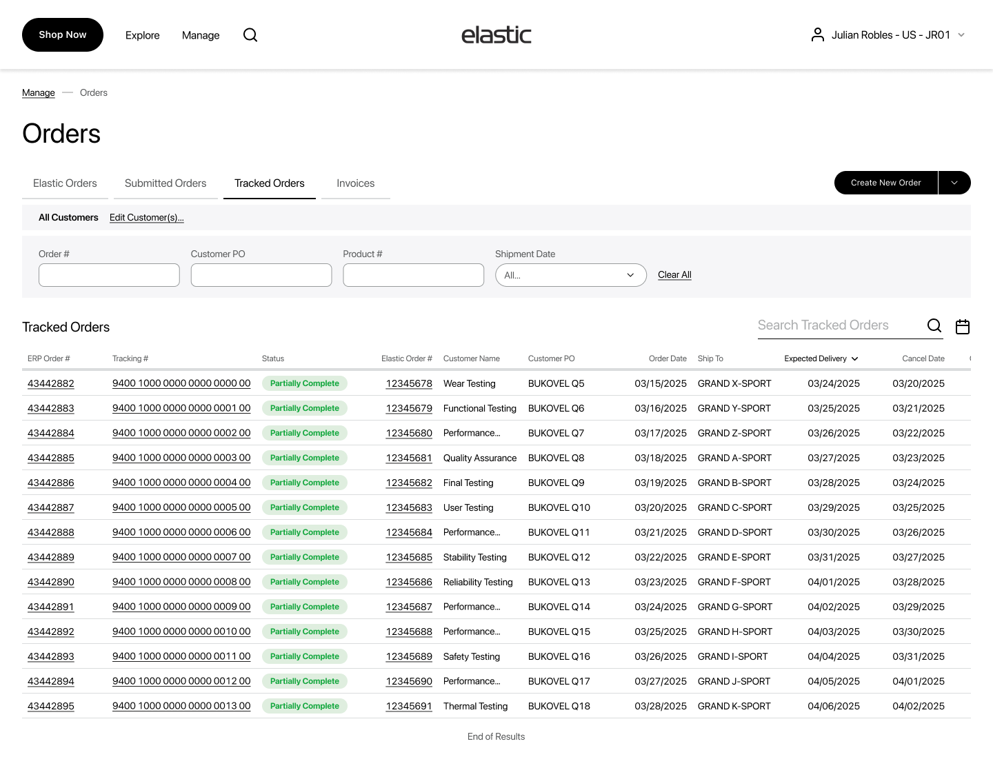
Fig. 11 — Deliveries table-only experience
Design Constraints:
Preserve existing workflow
Table view must remain for detailed review
Support scheduling mindset
Users need date and day visibility
Keep interaction simple
Switching views should be lightweight
Maintain consistency
Align with listing page behaviors
Options Explored:
Option 01
Keep calendar view only per page
Familiar and implemented

Useful for detailed scanning
Weak for time-based planning
Doesn't support scheduling
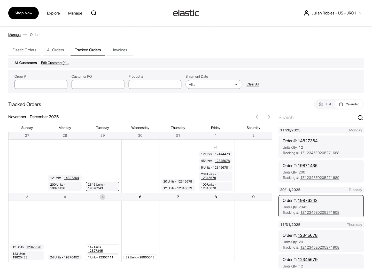
Fig. 12
Option 02
Add shipments as a different table
Supports both workflows
Gives flexibility
Best balance
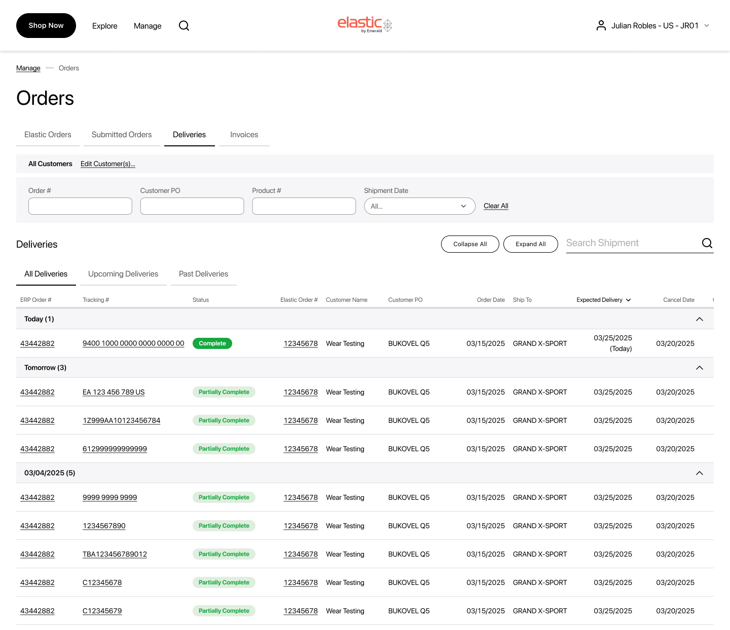
Fig. 13
Final Decision
Dual-view pattern with toggle for MVP and feedback
Introduce a view switcher in the Deliveries tab that allows users to open Calendar. The table remains the default for detailed management, while Calendar View supports planning and schedule visibility. The goal is not to replace the table, but to complement it.
Rationale
• Existing Calendar Component
• Supports both operational review and planning
• Aligns UI with user mental models
• Keeps default experience familiar
• Adds value without replacing workflows
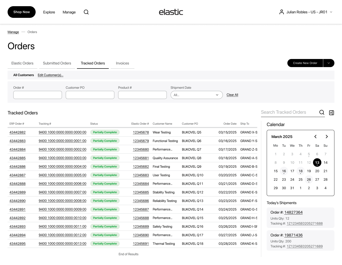
Fig. 14 — Final deliveries calendar view
details page
Details Page
Completely New Details Page
Designing for High and Low Density Data
Design Constraints:
Multi‑brand variability
Each brand’s ERP exposes a different set and volume of fields (order attributes, statuses, discount schemes, etc.).
Support multiple states
The page must show Order Details and Items, where items can have per-size statuses (e.g., canceled / open / delivered), and status vocabularies vary by brand.
Support Multiple Sources
Elastic Orders / ERP Orders
Decision:
The detail page had to support minimal orders and highly complex orders in one system. It needed to handle order-level data, shipment-level information, and product-level detail.
Some orders required layered or nested table patterns to accommodate multiple shipments with different products, quantities, and pricing structures.
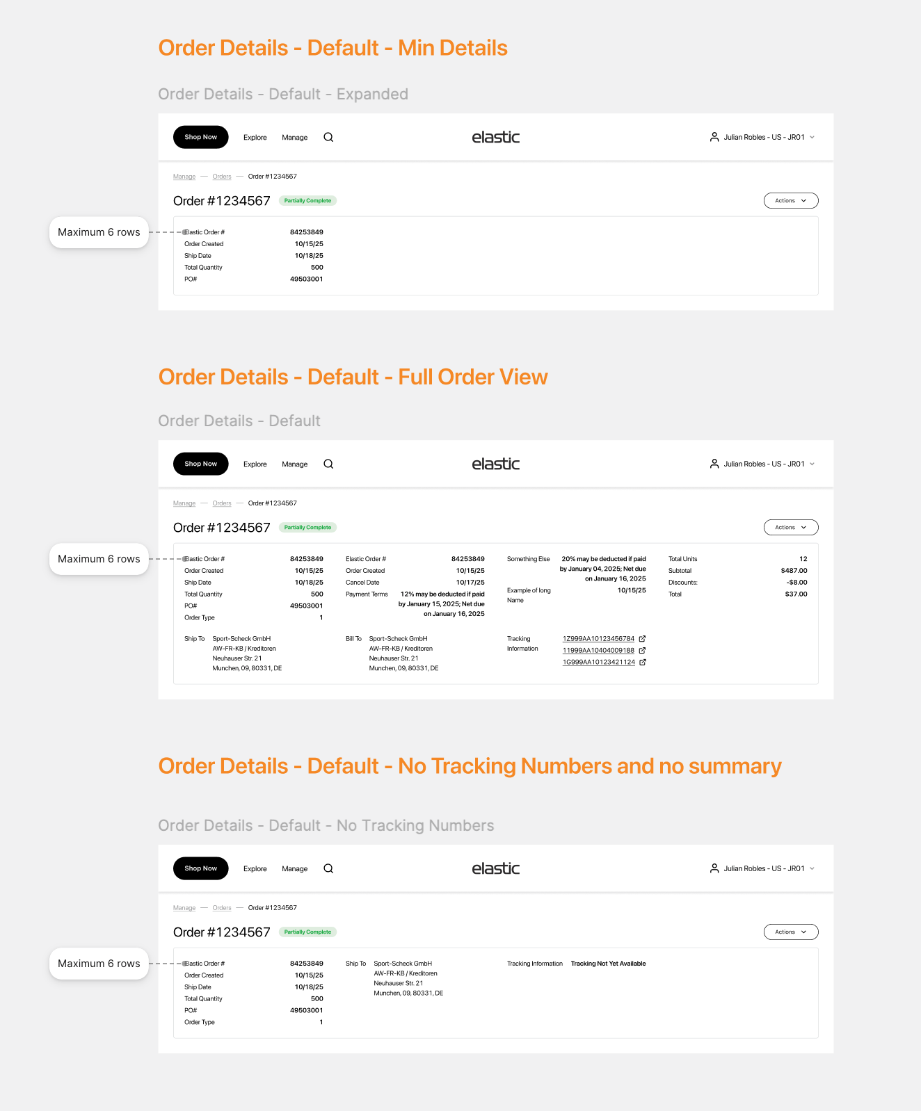
Fig. 15 — Order detail / high-density state
Order Details Difference - Details Level
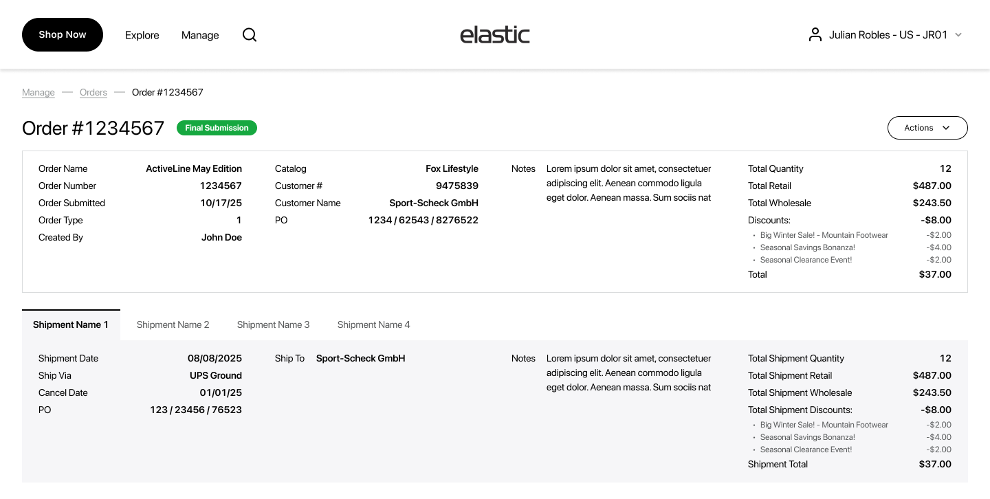
Fig. 16 — Elastic Order Multiple Shipments
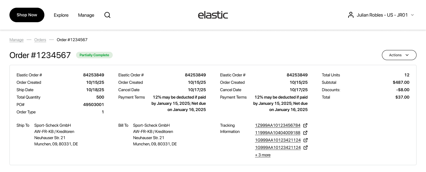
Fig. 17 — ERP Order
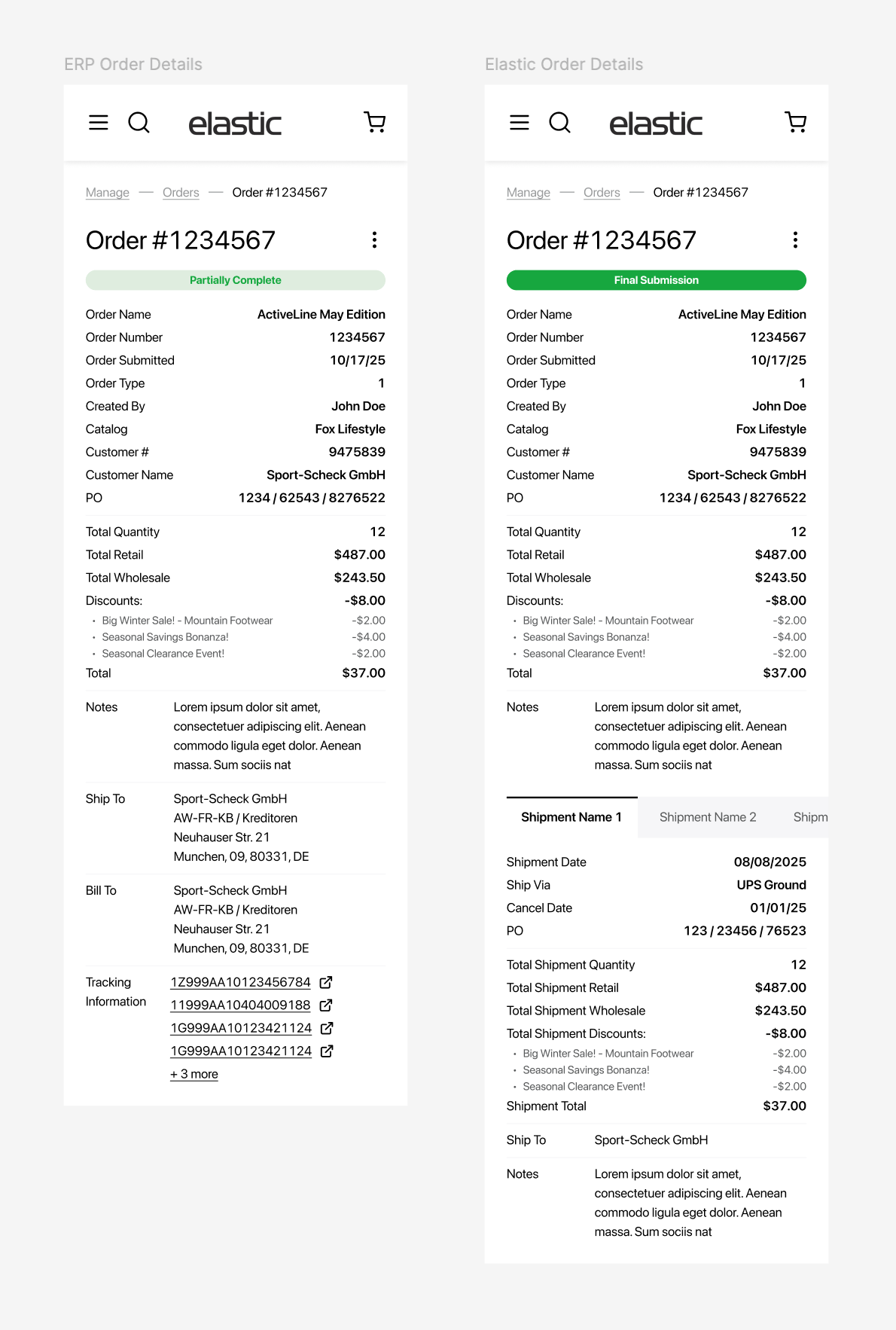
Fig. 18 — Mobile - Comparison
Order Details Difference - Products Level
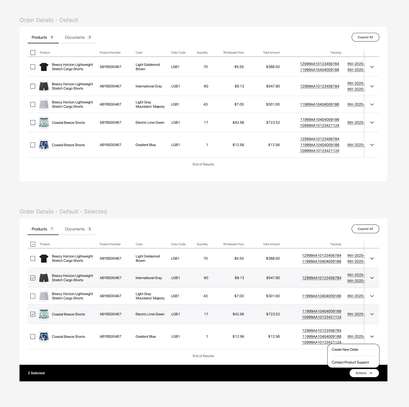
Fig. 19 — un/selected state
Design System Update
We already had components for the table and its cells, but nothing for expanded rows. I had to design that pattern from scratch, not just visually, but as a reusable interaction.
I worked closely with an engineer to make sure the solution felt consistent, practical, and scalable. Since the feature needed to support bulk selection, I introduced a bottom action bar that appears once even one row is selected. It shows the number of selected rows and gives access to actions and notes in one clear place.
This helped keep the table clean, made bulk actions feel more intuitive, and created a pattern we could reuse across other table experiences.
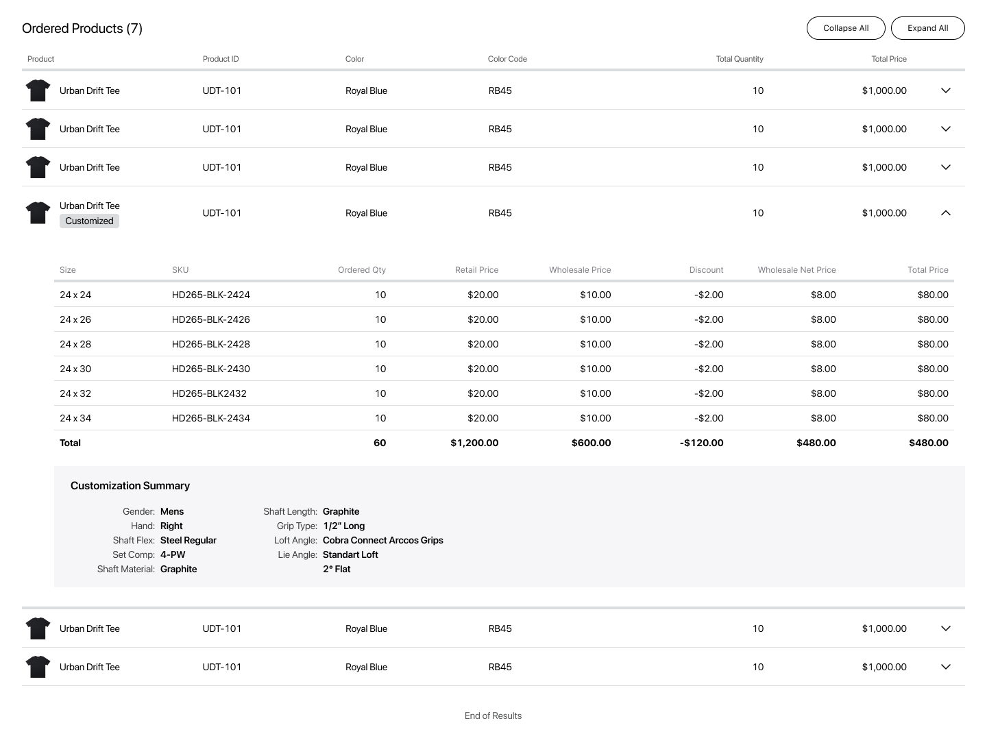
Fig. 20 — Customization Summary
Fig. 21 — Overflowing States and Edge Cases
Final Outcome
Updated Orders
Better scanability
Improved visual hierarchy
Clearer context
Proximity to work area
More confidence
Stronger status visibility
Flexible views
Table + calendar toggle
Reduced errors
Customer scope clarity
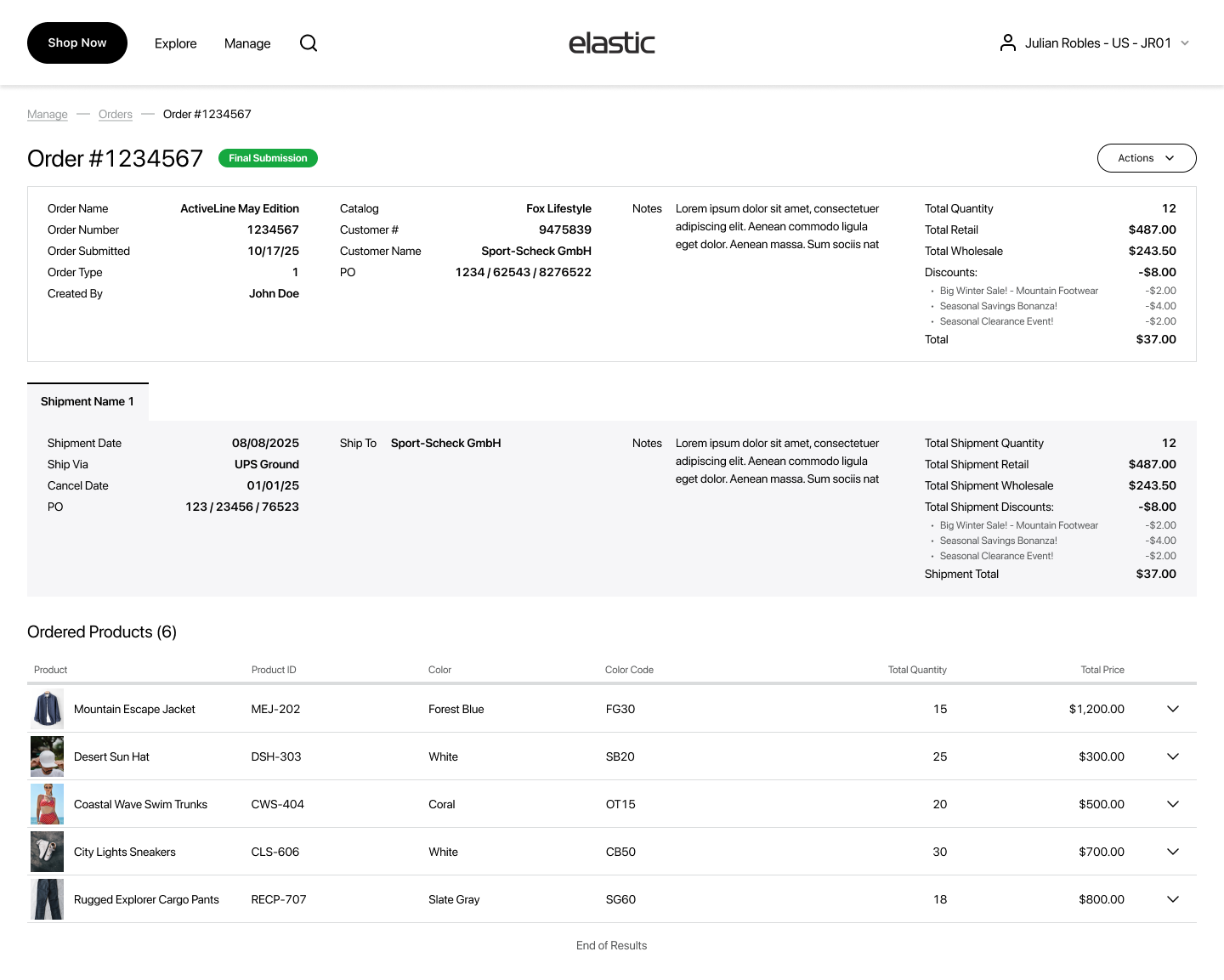
Fig. 23 — Final high-fidelity interface
Reflection
What This Project Taught Me
What improved for users
Users can now scan orders faster, understand customer context at a glance, and switch between table and calendar views based on their workflow needs. The redesign reduced errors and increased confidence in order management.
Why this mattered in B2B
In B2B contexts, small friction points compound across daily workflows. Improving scanability and reducing errors has a multiplied impact when users interact with the system dozens of times per day.
What this taught me
Balancing ideal-state design with MVP constraints requires strategic thinking about what to ship now versus later. Proximity and visibility are critical in operational interfaces where speed and accuracy matter.
Future opportunities
Next steps include advanced filtering, saved views, bulk actions, and deeper analytics. The foundation is now set for iterative improvements that build on the core experience.
Case Study
Redesign
Order History
Redesigning a dense B2B order management experience to improve scanability, clarity, and confidence in daily workflows
Role
Product Designer
Team
1 Designer, 3 Engineers, 1 PM
Timeline
Jan 2025 - Feb 2026
Platform
B2B Web Application
My Role
UX strategy, information architecture, interaction design, usability testing
Tools
Figma, Amplitude, Jira, Confluence, CoPilot
Collaboration
Cross-functional with engineering, product, and business stakeholders
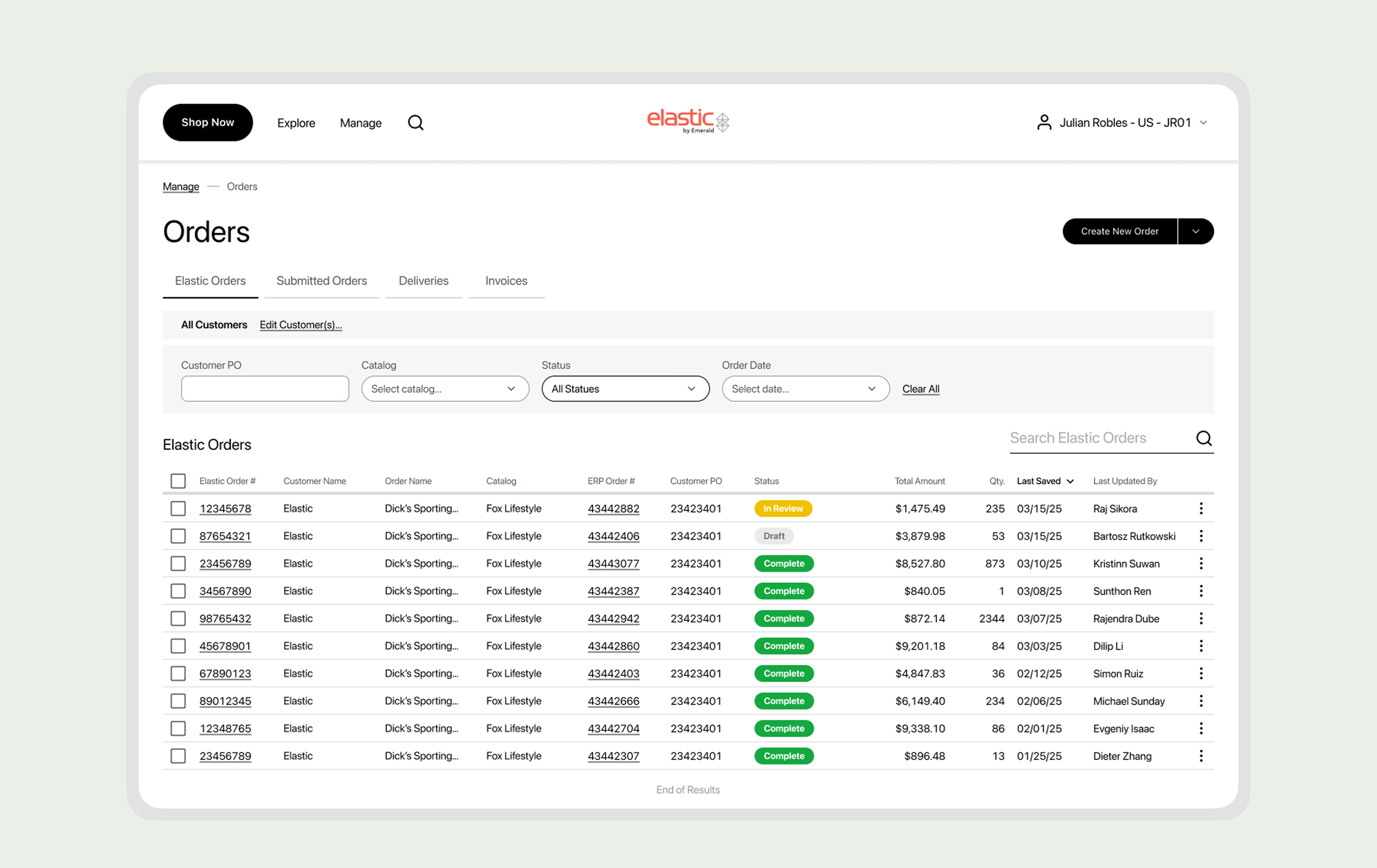
Fig. 01 — Updated order history interface
Key Points
Discovery
Led discovery to define the problem, success metrics, and constraints and Ran a comparative audit of three primary Order History experiences to benchmark filters, scan patterns, exports, and performance, informing v1 scope and the roadmap.
Design Startegy
Unified a single, responsive table component usable across Order Listing and Invoice Listing, supporting dynamic column schemas per client (data availability/permissions), and extended the same pattern principles to Order Detail and Invoice Detail line‑items for consistency.
Collaboration
Partnered with Engineering and PMs to streamline design→dev handoff: documented component specs, annotated empty/error/loading states and wrote acceptance criteria.
Research
Insights
74%
Users needed faster order scanning
45%
Filters created friction
62%
Customer context easy to miss
10-15m
Average search time for order details
The Existing Experience
Original Order History
Fig. 02 — Order History - Elastic
Fig. 03 — Custom Order History for our large Client
Fig. 04 — Order History - Microsite
Strategy & Approach
Prioritize scanability
Improve visual hierarchy and spacing to support faster information retrieval
Reduce friction in filtering
Clarify filter relationships and active states for confident selection
Make customer context visible
Position customer scope near the work area to prevent errors
Balance clarity with constraints
Ship incremental value while maintaining design quality
Fig. 05 — Design strategy and prioritization
Scoping & Prioritization
What Shipped in MVP
Ship Now
Table hierarchy improvements
Customer scope repositioning
Filter structure clarity
Status visibility enhancements
Calendar view for deliveries
One Page with Listing for all Orders from different sources
Later Iteration
Custom view saving and templates
Enhanced export capabilities
Inline editing functionality
Design Decisions
Reposition the Customer Selector Bar
Design Constraints
Selector location
Selector should be part of the filters and be as close to the table as possible
vertical space
Avoid pushing the table below the fold
multiple states
Single, all customers, and multi-customer
mvp
Keep all components from the design system
Problem
The customer selector originally sat too far from the order table, so users often missed the active customer context and reviewed the wrong customer's orders before correcting their filters. The issue was not only visibility, but also poor proximity to where the task actually happened.
Fig. 06 — Original selector placement issue
Options Explored
Option 01
Inline customer pills
Explicit current scope
Good visibility
Scales poorly
Pushes table downward
Fig. 07
Option 02
Pills with overflow dropdown
Handles scale better
Reduces overflow
Adds complexity
Mixed discoverability
Fig. 08
Final Decision
Thin context bar with modal
Rationale
• Minimal vertical footprint
• Visible near the work area
• Supports single, all, and multi-customer states
• Simpler MVP implementation
Introduce a thin context bar directly above the table and near the filters. Keep the surface minimal while moving richer customer-selection interactions into a modal for MVP. This preserves vertical space, improves visibility at the point of use, and supports multiple customer states without introducing a heavy inline component.
Fig. 09 — Final selected solution
Design Decisions
Filters
Design Constraints
Multi‑brand variability
Each brand can expose a different set and count of data columns/fields → filters must adapt to available data and permissions.
Keep the table visible
Order table should remain as high as possible; we cannot afford a tall filter block eating vertical space.
Speed first
Users need quick filters for 80–90% of lookups; deeper filters should serve exceptional and compound cases.
Design Decisions:
Filters bar + Additional Filters modal
Modal grouped by categories, rendering only filters that match the brand’s schema (dynamic availability by columns/permissions).
Why Modal for Additional Filters?
- Quick chips cover ~80–90% of queries. The modal holds the long-tail fields so the header stays clean.
- On small screens, the modal becomes a slide-up sheet, so same structure, no new layout to learn.
- Room for grouped sections (Order / Payment / Shipping / Customer - could be modified), helper text and date presets, without squeezing controls.
Fig. 10 — Filters and additional filters modal
Design Decisions
Calendar View to Deliveries
Problem
The Deliveries experience originally relied only on a table view. While this worked well for row-level management and detailed review, it did not support time-based planning as effectively. Delivery workflows often require users to think in terms of dates, schedules, and volume across days.
Fig. 11 — Deliveries table-only experience
Design Constraints
Preserve existing workflow
Table view must remain for detailed review
Support scheduling mindset
Users need date and day visibility
Keep interaction simple
Switching views should be lightweight
Maintain consistency
Align with listing page behaviors
Options Explored
Option 01
Keep calendar view only per page
Familiar and implemented
Useful for detailed scanning
Weak for time-based planning
Doesn't support scheduling
Fig. 12
Option 02
Add shipments as a different table
Supports both workflows
Gives flexibility
Best balance
Fig. 13
Final Decision
Dual-view pattern with toggle for MVP and feedback
Introduce a view switcher in the Deliveries tab that allows users to open Calendar. The table remains the default for detailed management, while Calendar View supports planning and schedule visibility. The goal is not to replace the table, but to complement it.
Rationale
• Existing Calendar Component
• Supports both operational review and planning
• Aligns UI with user mental models
• Keeps default experience familiar
• Adds value without replacing workflows
Fig. 14 — Final deliveries calendar view
Design Decisions
Details Page
Completely New Details Page
Designing for High and Low Density Data
Design Constraints
Multi‑brand variability
Each brand’s ERP exposes a different set and volume of fields (order attributes, statuses, discount schemes, etc.).
Support multiple states
The page must show Order Details and Items, where items can have per-size statuses (e.g., canceled / open / delivered), and status vocabularies vary by brand.
Support Multiple Sources
Elastic Orders / ERP Orders
Decision
The detail page had to support minimal orders and highly complex orders in one system. It needed to handle order-level data, shipment-level information, and product-level detail.
Some orders required layered or nested table patterns to accommodate multiple shipments with different products, quantities, and pricing structures.
Fig. 15 — Order detail / high-density state
Order Details Difference - Details Level
Fig. 16 — Elastic Order Multiple Shipments
Fig. 17 — ERP Order
Fig. 18 — Mobile - Comparison
Order Details Difference - Products Level
Fig. 19 — un/selected state
Design System Update
We already had components for the table and its cells, but nothing for expanded rows. I had to design that pattern from scratch, not just visually, but as a reusable interaction.
I worked closely with an engineer to make sure the solution felt consistent, practical, and scalable. Since the feature needed to support bulk selection, I introduced a bottom action bar that appears once even one row is selected. It shows the number of selected rows and gives access to actions and notes in one clear place.
This helped keep the table clean, made bulk actions feel more intuitive, and created a pattern we could reuse across other table experiences.
Fig. 20 — Customization Summary
Fig. 21 — Overflowing States and Edge Cases
Final Outcome
Updated Orders
Better scanability
Improved visual hierarchy
Clearer context
Proximity to work area
More confidence
Stronger status visibility
Flexible views
Table + calendar toggle
Reduced errors
Customer scope clarity
Fig. 23 — Final high-fidelity interface
Reflection
What This Project Taught Me
What improved for users
Users can now scan orders faster, understand customer context at a glance, and switch between table and calendar views based on their workflow needs. The redesign reduced errors and increased confidence in order management.
Why this mattered in B2B
In B2B contexts, small friction points compound across daily workflows. Improving scanability and reducing errors has a multiplied impact when users interact with the system dozens of times per day.
What this taught me
Balancing ideal-state design with MVP constraints requires strategic thinking about what to ship now versus later. Proximity and visibility are critical in operational interfaces where speed and accuracy matter.
Future opportunities
Next steps include advanced filtering, saved views, bulk actions, and deeper analytics. The foundation is now set for iterative improvements that build on the core experience.
Get in Touch
Previous Case
Next Case
Previous Case
Next Case
Get in Touch
Case Study
Redesign
Order History
Redesigning a dense B2B order management experience to improve scanability, clarity, and confidence in daily workflows
Role
Product Designer
Team
1 Designer, 3 Engineers, 1 PM
Timeline
Jan 2025 - Feb 2026
Platform
B2B Web Application
My Role
UX strategy, Discovery, Information Architecture, Interaction Design, Design System Alignment, Usability Testing
Collaboration
Cross-functional with engineering, qa, product and clients
Tools
Figma (Figma Make, FigJam), Amplitude, Jira, Confluence, Claude
Fig. 01 — Updated order history interface
Key Points
Discovery
Led discovery to define the problem, success metrics, and constraints and Ran a comparative audit of three primary Order History experiences to benchmark filters, scan patterns, exports, and performance, informing v1 scope and the roadmap.
Design Startegy
Unified a single, responsive table component usable across Order Listing and Invoice Listing, supporting dynamic column schemas per client (data availability/permissions), and extended the same pattern principles to Order Detail and Invoice Detail line‑items for consistency.
Collaboration
Partnered with Engineering and PMs to streamline design→dev handoff: documented component specs, annotated empty/error/loading states and wrote acceptance criteria.
Research
Insights
74%
Users needed faster order scanning
45%
Filters created friction
62%
Customer context easy to miss
10-15m
Average search time for order details
The Existing Experience
Original Order History Options
Fig. 02 — Order History - Elastic
Fig. 03 — Custom Order History for our large Client
Fig. 04 — Order History - Microsite
Strategy & Approach
01
Prioritize scanability
Improve visual hierarchy and spacing to support faster information retrieval
02
Reduce friction in filtering
Clarify filter relationships and active states for confident selection
03
Make customer context visible
Position customer scope near the work area to prevent errors
04
Balance clarity with constraints
Ship incremental value while maintaining design quality
Fig. 05 — Wireframe
Scoping & Prioritization
What Shipped in MVP
Ship Now
One Page with Listing for all Orders from different sources
Order Details Page with ability to create new Order
Customer bar repositioning
Filter structure clarity
Status visibility enhancements
Calendar view for deliveries
Later Iteration
Custom view saving and templates
Enhanced export capabilities
Inline editing functionality
Design Decisions
Reposition the Customer Selector Bar
Design Constraints
Selector location
Selector should be part of the filters and be as close to the table as possible
vertical space
Avoid pushing the table below the fold
multiple states
Single, all customers, and multi-customer
mvp
Keep all components from the design system
Problem
The customer selector originally sat too far from the order table, so users often missed the active customer context and reviewed the wrong customer's orders before correcting their filters. The issue was not only visibility, but also poor proximity to where the task actually happened.
Fig. 06 — Original selector placement issue
Options Explored
Option 01
Inline customer pills
Good visibility
Explicit current scope
Scales poorly
Pushes table downward
Fig. 07
Option 02
Pills with overflow dropdown
Handles scale better
Reduces overflow
Adds complexity
Mixed discoverability
Fig. 08
Final Decision
Context bar with modal
Introduce a thin context bar directly above the table and near the filters. Keep the surface minimal while moving richer customer-selection interactions into a modal for MVP.
This preserves vertical space, improves visibility at the point of use, and supports multiple customer states without introducing a heavy inline component.
Rationale
• Visible near the work area
• Minimal vertical footprint
• Supports single, all, and multi-customer states
• Simpler MVP implementation
Fig. 09 — Final selected solution
Design Decisions
Filters
Design Constraints
Multi‑brand variability
Each brand can expose a different set and count of data columns/fields → filters must adapt to available data and permissions.
Keep the table visible
Order table should remain as high as possible; we cannot afford a tall filter block eating vertical space.
Speed first
Users need quick filters for 80–90% of lookups; deeper filters should serve exceptional and compound cases.
Design Decisions:
Filters bar + Additional Filters modal
Modal grouped by categories, rendering only filters that match the brand’s schema (dynamic availability by columns/permissions).
Why Modal for Additional Filters?
- Quick chips cover ~80–90% of queries. The modal holds the long-tail fields so the header stays clean.
- On small screens, the modal becomes a slide-up sheet, so same structure, no new layout to learn.
- Room for grouped sections (Order / Payment / Shipping / Customer - could be modified), helper text and date presets, without squeezing controls.
Fig. 10 — Filters and additional filters modal
Design Decisions
Calendar View to Deliveries
Design Constraints
Preserve existing workflow
Table view must remain for detailed review
Support scheduling mindset
Users need date and day visibility
Keep interaction simple
Switching views should be lightweight
Maintain consistency
Align with listing page behaviors
Problem
The Deliveries experience originally relied only on a table view. While this worked well for row-level management and detailed review, it did not support time-based planning as effectively. Delivery workflows often require users to think in terms of dates, schedules, and volume across days.
Fig. 11 — Deliveries table-only experience
Options Explored
Option 01
Keep calendar view only per page
Familiar and implemented
Useful for detailed scanning
Weak for time-based planning
Doesn't support scheduling
Fig. 12
Option 02
Add shipments as a different table
Supports both workflows
Gives flexibility
Best balance
Fig. 13
Final Decision
Dual-view pattern with toggle for MVP and feedback
Introduce a view switcher in the Deliveries tab that allows users to open Calendar. The table remains the default for detailed management, while Calendar View supports planning and schedule visibility. The goal is not to replace the table, but to complement it.
Rationale
• Existing Calendar Component
• Supports both operational review and planning
• Aligns UI with user mental models
• Keeps default experience familiar
• Adds value without replacing workflows
Fig. 14 — Final deliveries calendar view
Design Decisions
Details Page
Completely New Details Page
Designing for High and Low Density Data
Design Constraints
Multi‑brand variability
Each brand’s ERP exposes a different set and volume of fields (order attributes, statuses, discount schemes, etc.).
Support multiple states
The page must show Order Details and Items, where items can have per-size statuses (e.g., canceled / open / delivered), and status vocabularies vary by brand.
Support Multiple Sources
Elastic Orders / ERP Orders
Decision
The detail page had to support minimal orders and highly complex orders in one system. It needed to handle order-level data, shipment-level information, and product-level detail.
Some orders required layered or nested table patterns to accommodate multiple shipments with different products, quantities, and pricing structures.
Fig. 15 — Order detail / high-density state
Order Details Difference - Details Level
Fig. 16 — Elastic Order Multiple Shipments
Fig. 17 — ERP Order
Fig. 18 — Mobile - Comparison
Order Details Difference - Products Level
Fig. 19 — un/selected state
Design System Update
We already had components for the table and its cells, but nothing for expanded rows. I had to design that pattern from scratch, not just visually, but as a reusable interaction.
I worked closely with an engineer to make sure the solution felt consistent, practical, and scalable. Since the feature needed to support bulk selection, I introduced a bottom action bar that appears once even one row is selected. It shows the number of selected rows and gives access to actions and notes in one clear place.
This helped keep the table clean, made bulk actions feel more intuitive, and created a pattern we could reuse across other table experiences.
Fig. 20 — Customization Summary
Fig. 21 — Mobile
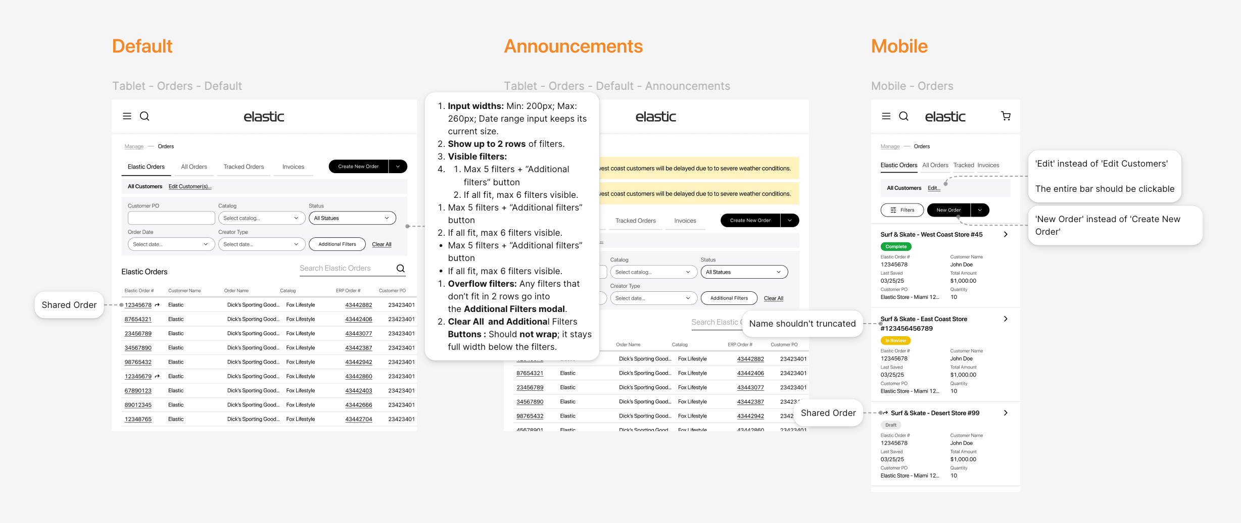
Fig. 22 — Responsive
Final Outcome
Updated Orders
Fig. 23 — Final high-fidelity interface
Better scanability
Improved visual hierarchy
Clearer context
Proximity to work area
More confidence
Stronger status visibility
Flexible views
Table + calendar toggle
Reduced errors
Customer scope clarity
Reflection
What This Project Taught Me
What improved for users
Users can now scan orders faster, understand customer context at a glance, and switch between table and calendar views based on their workflow needs. The redesign reduced errors and increased confidence in order management.
Why this mattered in B2B
In B2B contexts, small friction points compound across daily workflows. Improving scanability and reducing errors has a multiplied impact when users interact with the system dozens of times per day.
What this taught me
Balancing ideal-state design with MVP constraints requires strategic thinking about what to ship now versus later. Proximity and visibility are critical in operational interfaces where speed and accuracy matter.
Future opportunities
Next steps include advanced filtering, saved views, bulk actions, and deeper analytics. The foundation is now set for iterative improvements that build on the core experience.